Goal and Aesthetic
Goal:
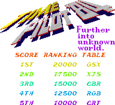
My goal is to create a visually stunning and immersive digital experience that captivates visitors and reflects my passion for creativity and innovation. The website should feel like a retro arcade game, as one can tell from the pixel art, bold buttons, and bright contrasting colors. This design aims to evoke nostalgia while providing a modern and engaging online space.
Aesthetic:
The aesthetic of your website is a nostalgic, retro arcade game-inspired design. The use of pixelated fonts, bold buttons, and bright, contrasting colors (such as yellow, orange, and sky blue) evokes a sense of playful nostalgia while maintaining a structured and engaging layout. This style invites users into a dynamic, game-like experience that is both visually striking and easy to navigate. The central alignment of the website name and navigation menu, along with the speech bubble-like content containers, reinforces the classic arcade game theme, creating a cohesive and immersive digital space.
Visual Design Elements
Typography:
Headings: The font style used is a pixelated, retro-inspired typeface to enhance the arcade game feel (Press Start 2P).
Font Size: Approximately 36px for headlines.
Body Text: A clean and readable pixelated font to ensure optimal legibility across various devices.
Font Size: Approximately 16px for body text.
Colour Palette
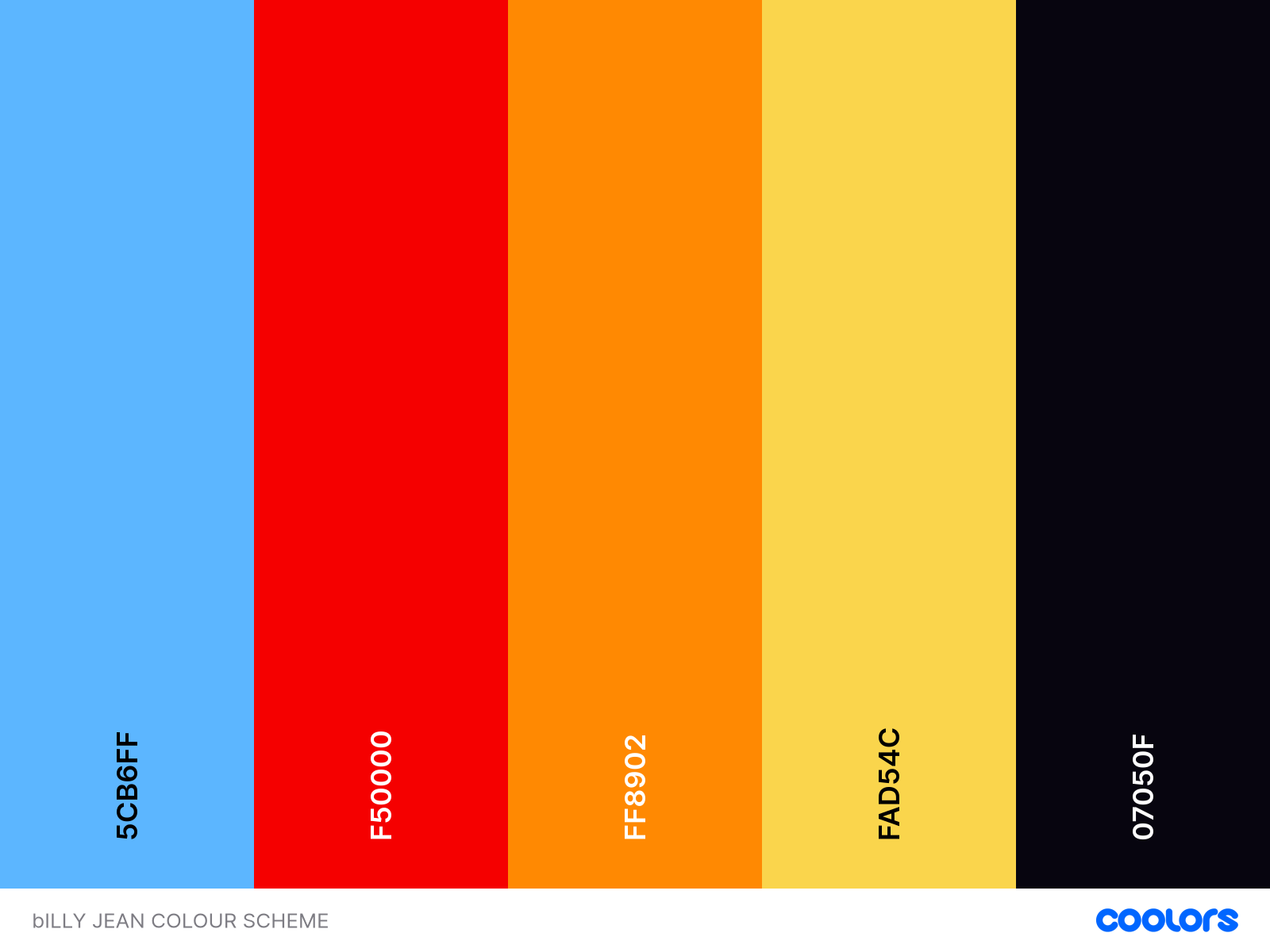
This is the color palette that I have chosen for my website. I chose these colors because they are vibrant and energetic, reflecting the dynamic and playful nature of a retro arcade game.
Primary Color:
Sky Blue (#5CB6FF): This bright, cheerful blue serves as the primary background color, creating a clean and engaging canvas for other design elements.
Secondary Colors:
Red (#F50000): This bold red is used for buttons and important call-to-action elements to draw immediate attention.
It is also used to coat my texts in the design pages to create that speech bubble effect.
Orange (#FF8902): A vivid orange used for highlights and interactive elements, adding a sense of energy and enthusiasm.
Yellow (#FAD54C): This sunny yellow is utilized for accents and to highlight key information, providing a warm contrast against the blue background.
Dark Grey (#07050F): A deep, nearly black grey used for text and other critical elements to ensure readability and provide a strong contrast.
Layout and Structure
Grid Layout:
Content is organized using a grid-based layout for consistency and visual harmony, ensuring that elements are aligned and spaced evenly.
Responsive Design:
The website is designed to be fully responsive, adapting seamlessly to various screen sizes and devices for optimal user experience.
Interactive Elements
Buttons:
Styled with bold, blocky shapes and a high contrast border to stand out. They have a subtle shadow effect for depth and dimension.
Hover effects include color changes to indicate interactivity.
Hyperlinks:
Styled with an underline and the primary accent color (#5CB6FF) to distinguish them from regular text and encourage click-throughs.
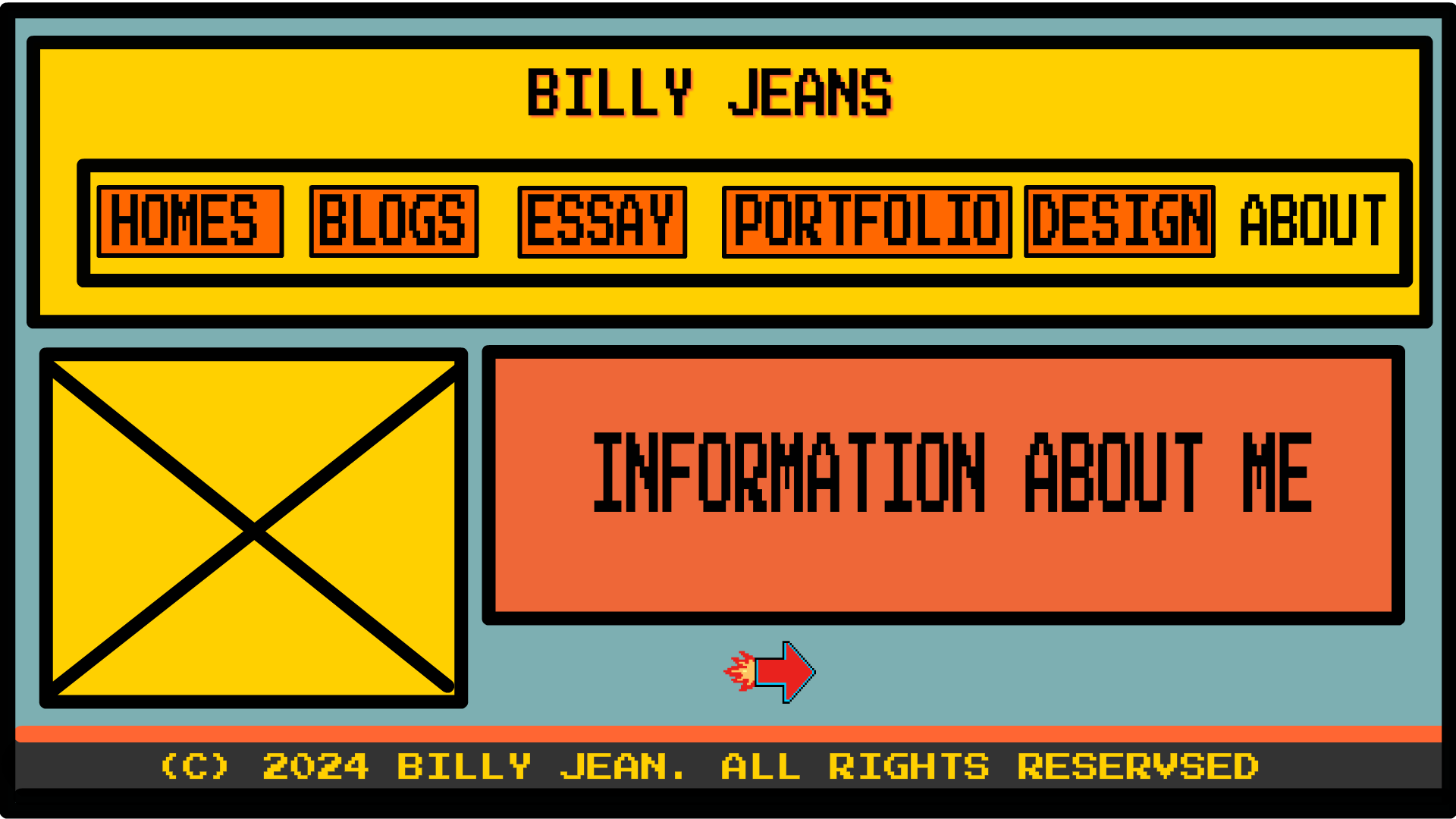
Visual Analysis of Uploaded Images
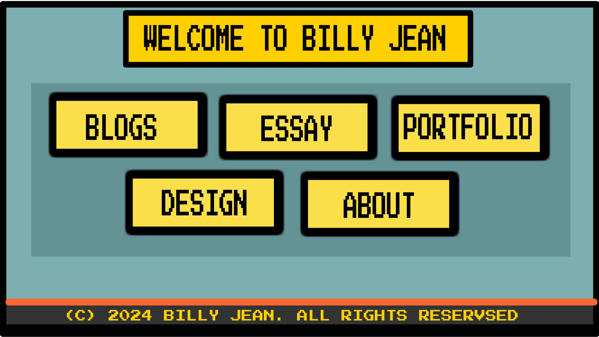
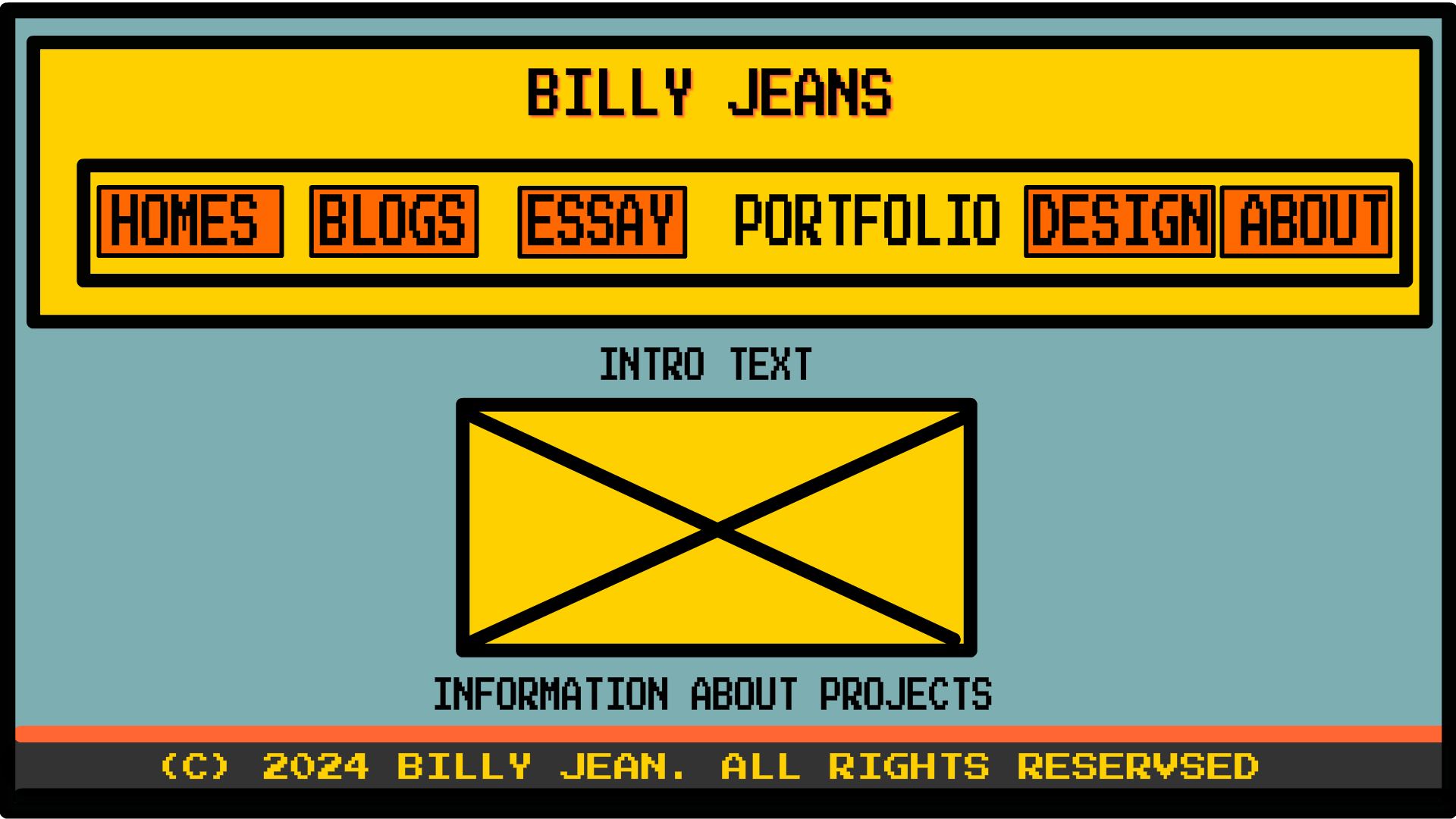
Home Page:
Navigation Bar: Bold and prominent with pixelated buttons in bright yellow and orange.
Main Content: Centered with large, clickable areas resembling arcade game interfaces.
Footer: Pixelated font and clear copyright notice.
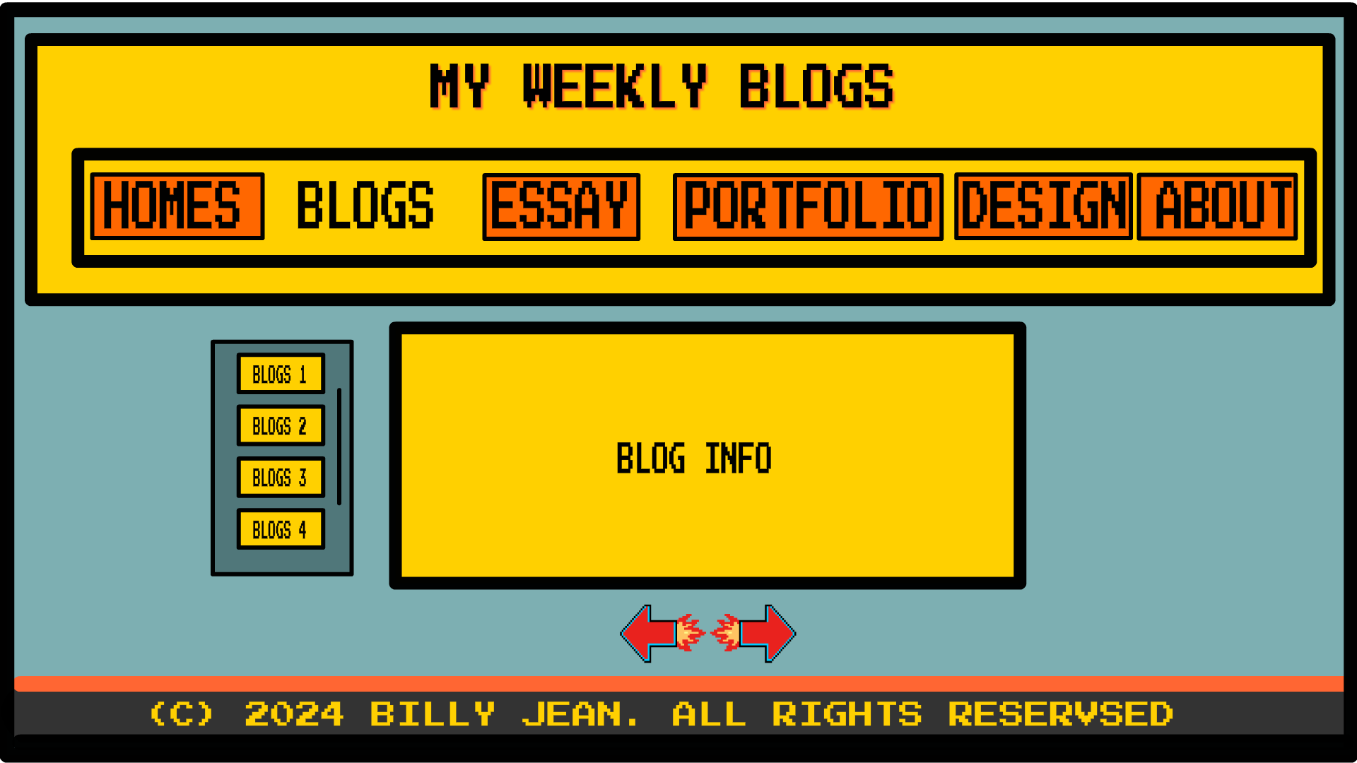
About Page:
Header: Consistent with the home page, maintaining the bold, pixelated navigation buttons.
Content Area: Split into sections with clear labels and pixelated icons to illustrate content.
Navigation Arrows: Styled as retro game controls to enhance the thematic consistency.
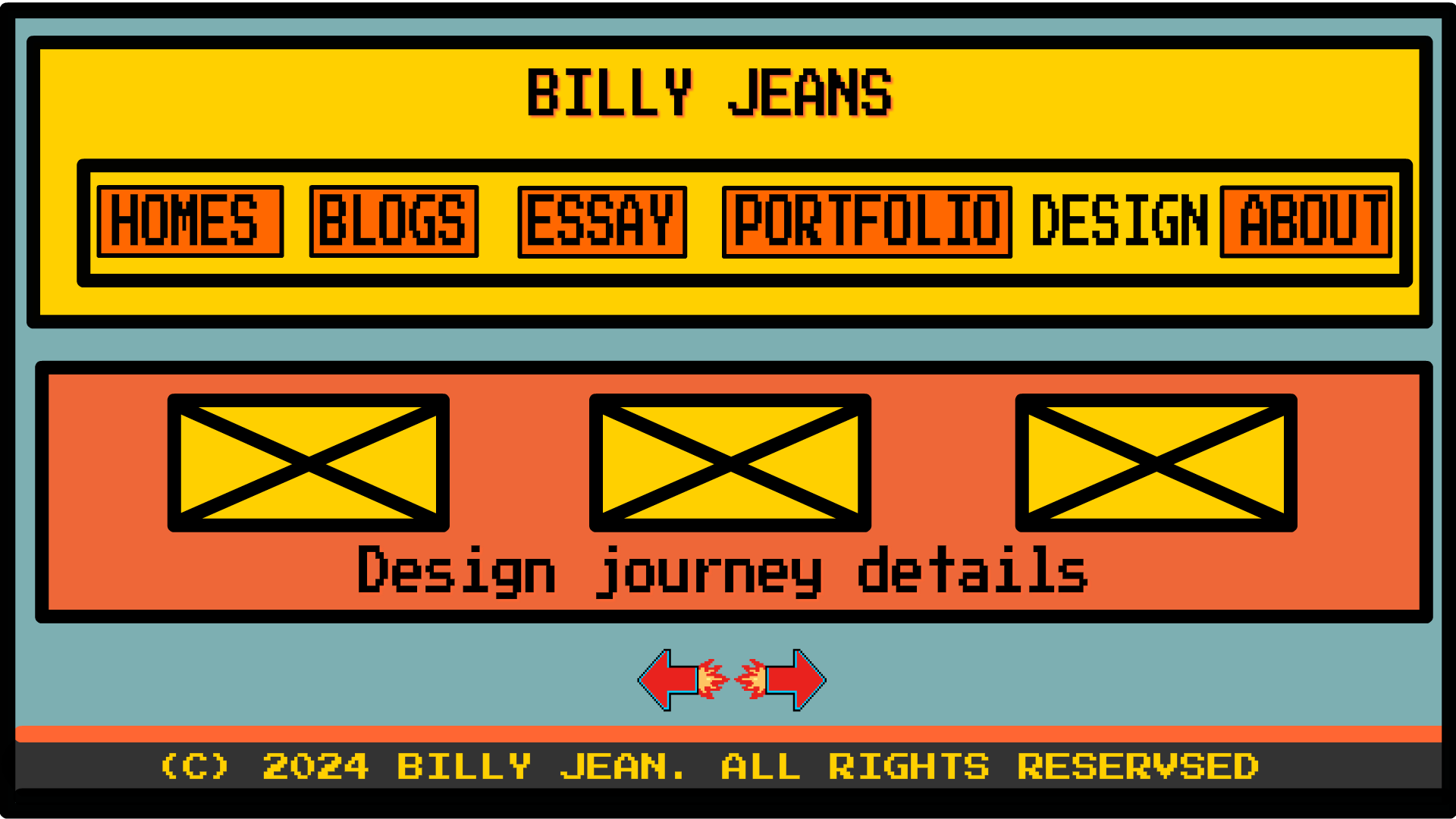
Design Page:
Content Boxes: Grid layout with large, clickable sections resembling game level selection screens.
Text: Pixelated and bold, ensuring readability and maintaining the arcade aesthetic.
Navigation Arrows: Styled to look like game controls, reinforcing the theme and to encourage entering the next page.
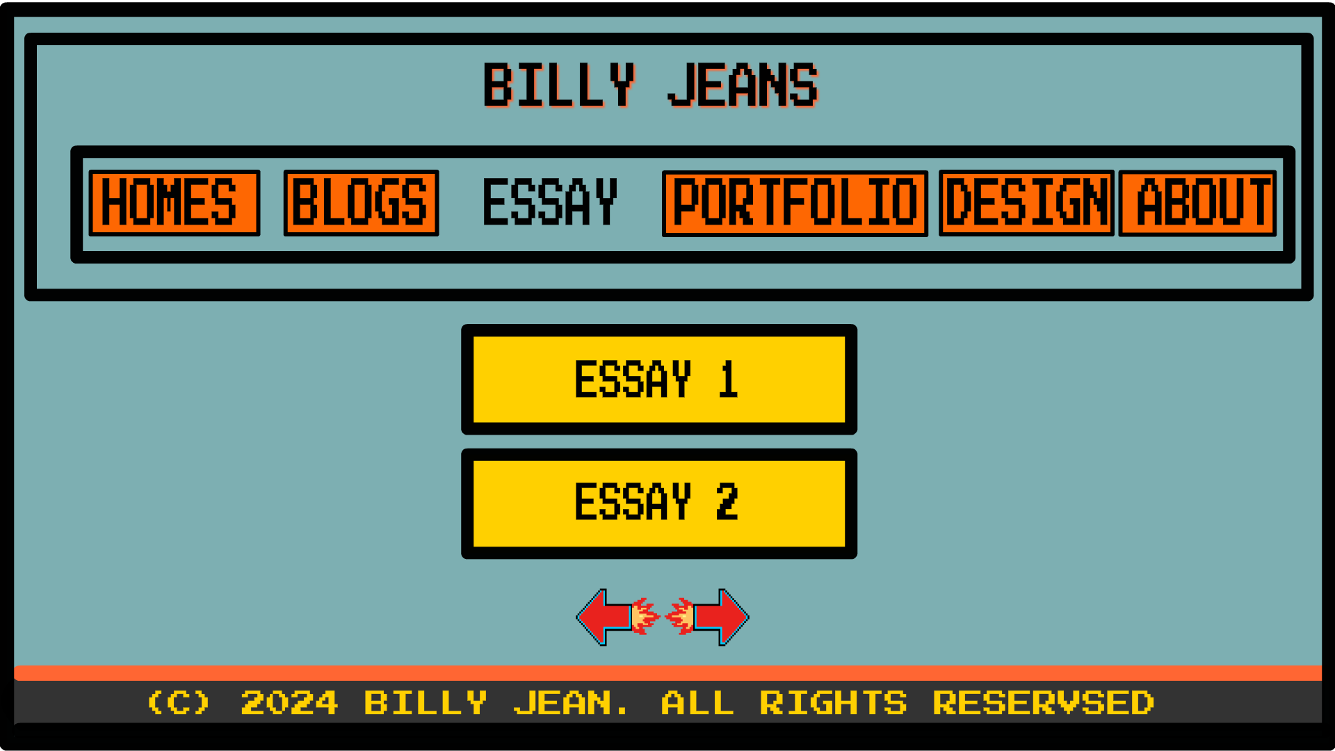
Essay Page:
Header: Consistent with other pages, featuring bold and pixelated navigation buttons.
Main Content Area: Essays are enclosed in larger pixel containers that need to be clicked on to enter. These containers are labeled "Essay 1" and "Essay 2," similar to the blog entries but larger in size.
Navigation Arrows: Styled as retro game controls, allowing users to easily navigate through different essays and to the next page.
Footer: Maintains the pixelated font style with a clear copyright notice, consistent with the overall design of the website.
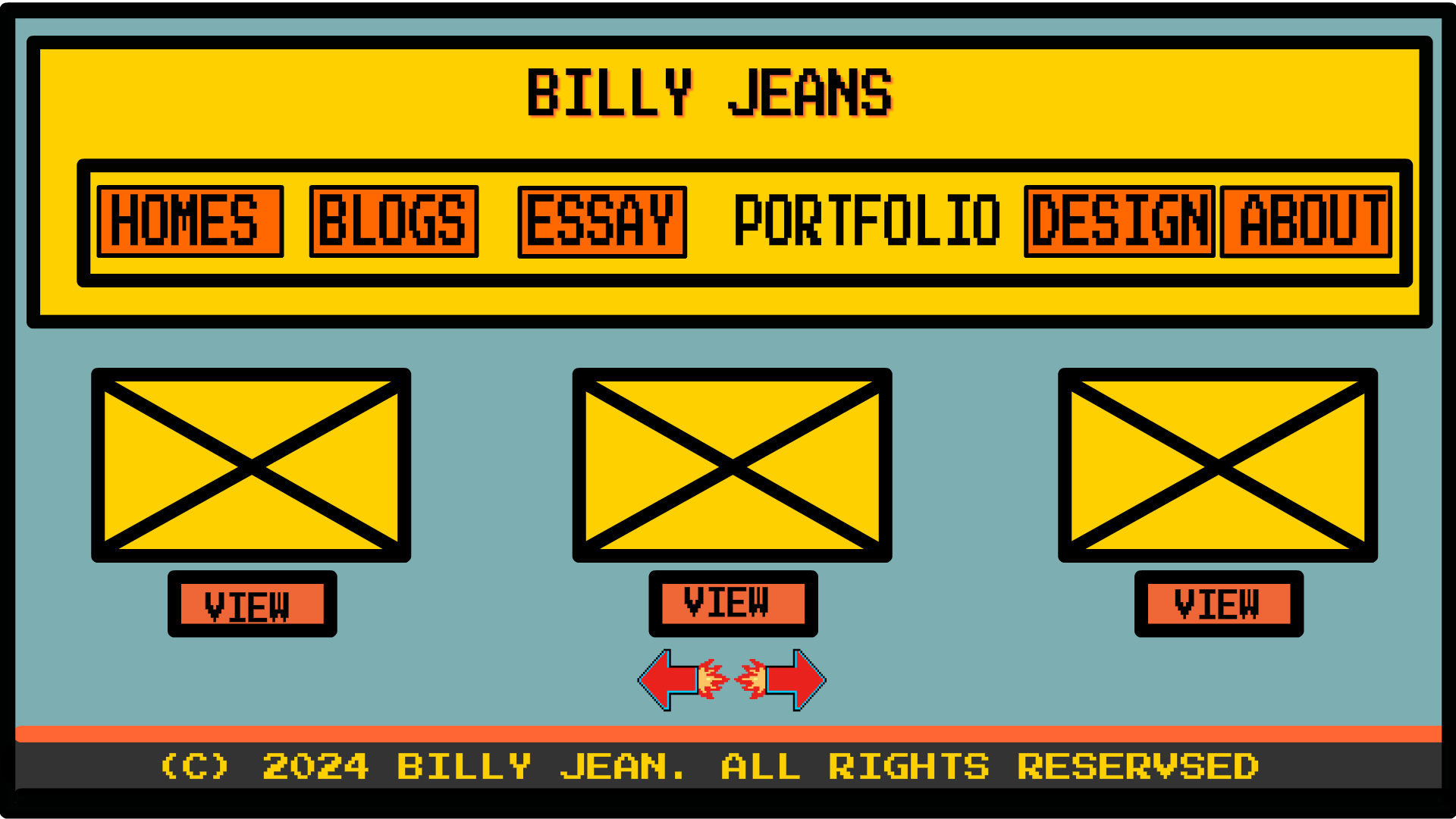
Portfolio Page:
Header: Similar to other pages with pixelated navigation buttons for consistency.
Content Grid: Features large, clickable sections resembling game levels, allowing users to navigate through different projects easily.
Project Views: Each project has a "View" button styled in a pixelated font, reinforcing the arcade game aesthetic.
Navigation Arrows: Styled as retro game controls, aiding in seamless navigation through different portfolio items and next page.
Footer: Clear and consistent with the pixelated design, featuring the copyright notice.
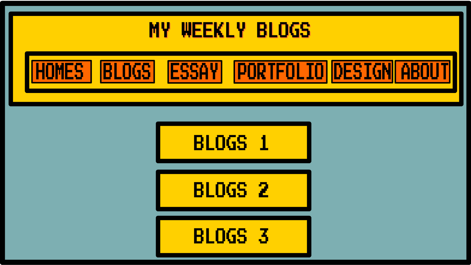
Blogs Page:
Header: Bold and pixelated, consistent with the site's overall design.
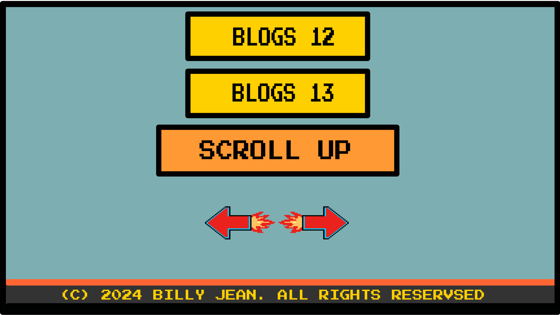
Blog Entries: Presented as large, clickable buttons labeled "Blogs 1," "Blogs 2," and "Blogs 3," each in a pixelated style.
Main Content Area: Clean and organized, making it easy for users to navigate through different blog entries.
Navigation Arrows: Styled as retro game controls, aiding to transition to the next page.
Footer: Maintains the consistent pixelated style with a clear copyright notice.
By integrating these elements and maintaining a consistent design language, the website successfully creates a nostalgic yet modern digital experience, reminiscent of a retro arcade game.
Text Alignment
Website Name and Navigation Menu:
I want my website name, "Billy Jean," to appear at the top middle of all my pages. Placing the website name centrally creates a balanced and prominent focal point that immediately captures the visitor's attention. Directly below the website name, the navigation menu will also be centrally aligned at the top. This ensures that users can easily access different sections of the website without any distraction.
Content Containers:
To enhance the retro arcade game aesthetic, most of my texts will be placed within containers that resemble speech bubbles, a common feature in many video games. These speech bubble containers will have bold outlines and vibrant background colors that stand out against the page, mimicking the dialogue boxes found in classic arcade games.
Page-Specific Alignments:
Headings: All page headings will be centrally aligned within their respective speech bubble containers. This alignment maintains consistency and highlights the importance of each section.
Body Text: The body text on all pages will be justified within their speech bubble containers. This alignment ensures a neat and professional look while fitting seamlessly within the retro game theme.
Example Alignment:
Homepage: The website name "Billy Jean" is prominently displayed at the top center, with the navigation menu directly below it. The rest of the content, such as introductory text and key highlights, will be within centrally aligned speech bubble containers.
Other Pages: Similar to the homepage, the website name and navigation menu are centrally aligned at the top. Each section of content, including headings and body text, will be enclosed in speech bubble containers to maintain thematic consistency.
By adopting this alignment and container style, my website will effectively evoke the nostalgic feel of retro arcade games while ensuring a user-friendly and visually engaging experience.
Broken Planet
I really like the Broken Planet website because of its captivating animated load-up screen. The stars listening and shifting away create an engaging and dynamic experience right from the start, which is a feature I want to implement for the Billy Jean website. This animation adds a sense of wonder and excitement, drawing users in and setting the tone for an interactive journey.
NFG Arcade Font Tools
The NFG Arcade Font Tools website stands out to me because of its interactive pixel font changer. The variety of fonts from famous Nintendo and arcade games like Street Fighter and The Legend of Zelda perfectly aligns with the retro gaming theme of Billy Jean. This feature allows users to interact with and explore different fonts, adding a playful and nostalgic element to the website.
Paint
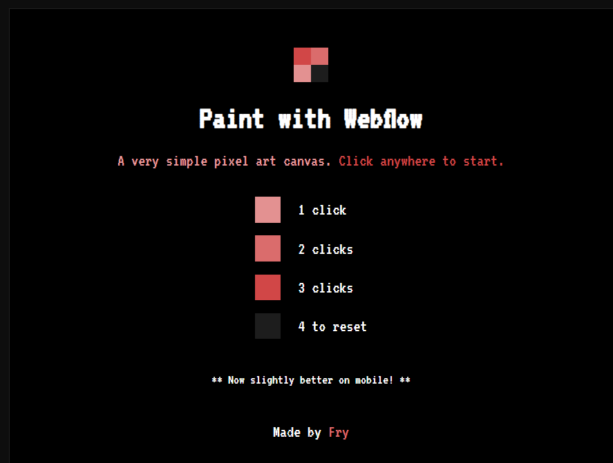
I appreciate the Paint website for its interactive painting system. The ability to select colors from a palette and paint on a blackboard creates a hands-on and creative experience. This feature aligns with my vision for Billy Jean, where users can engage with the website in a fun and interactive manner. The simplicity and effectiveness of this system are key elements I want to incorporate.
A City Built in HTML
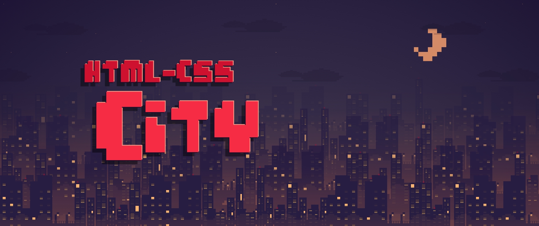
The website A City Built in HTML inspires me with its clean and retro pixel game style. The site looks like a game city with animated effects for windows opening and closing as you scroll. This attention to detail and interactivity is something I want to bring to Billy Jean. The retro aesthetic combined with modern interactive elements creates an immersive and engaging experience for users.
