Wireframes
Original Homepage
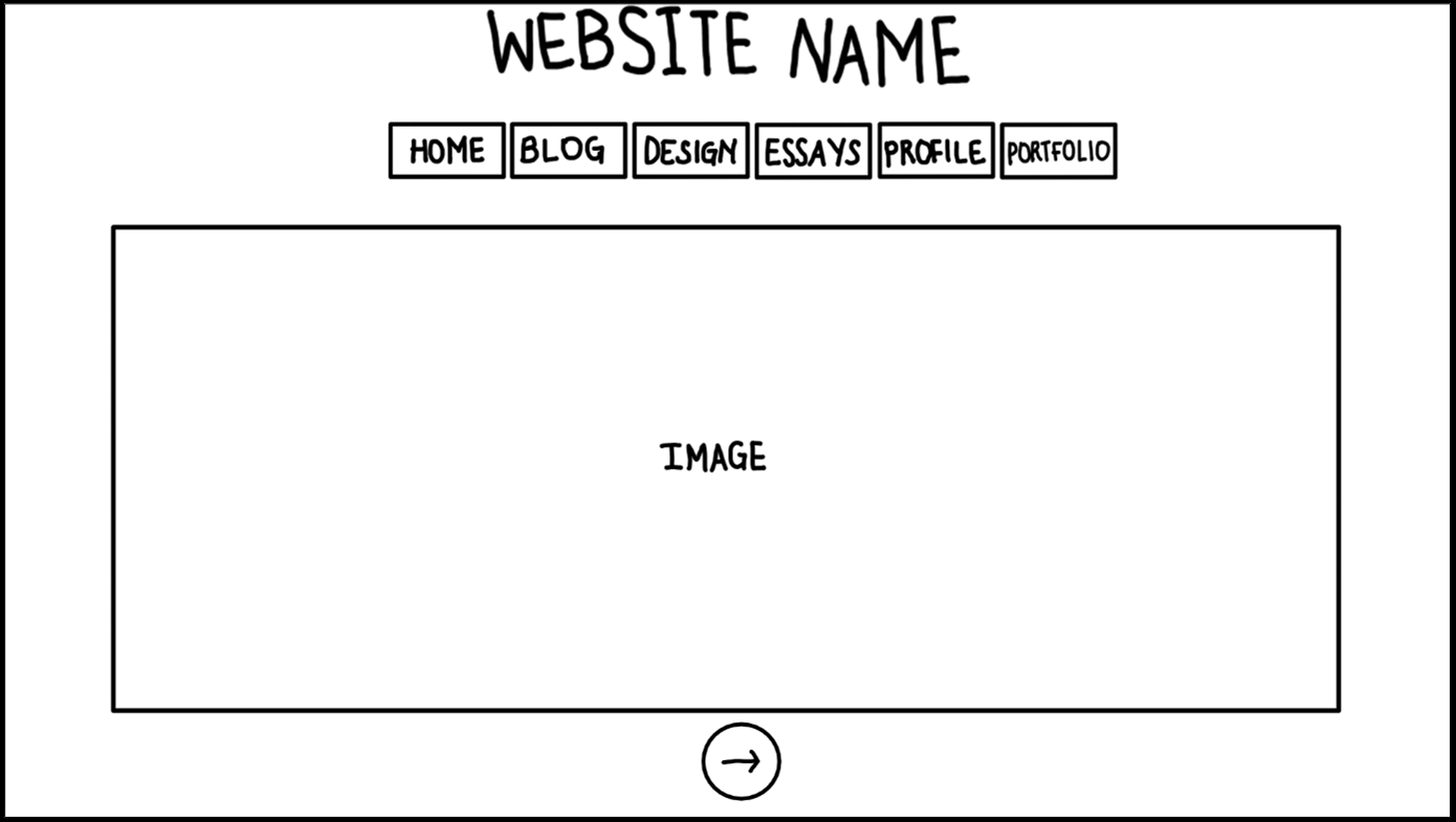
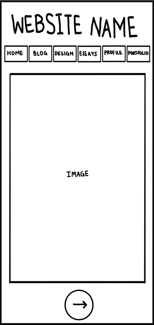
The homepage will have the website name at the top middle of the page. Underneath it will be a navigation menu that the user can click on to go to other pages. The rest of the page will be a large image that represents the theme of my website. I might animate the image to make it move around the page. Underneath the image, there will be a button to go to the next page.
In the mobile version for my website, the homepage would look like the image on the right. As seen in the image, the mobile version has the same structure as the desktop version. The navigation menu and the website name will be at the top of the page. Also, in the desktop version the image is landscape, so I would have to make sure that the full image is visible and not scrollable with the portrait view of a mobile phone.
I chose to only draw the desktop and mobile/smartphone versions for my website because that is what my target audience most likely use. Since this is my first website, I would rather focus on making my website responsive for the devices that a lot of people use instead of trying to do it for every single one. Eventually I will do responsive design for tablets or smaller laptops but for now, I want to make sure that I get the desktops and phones done right. (I have included most of the information about my target audience on the next page).
Final Homepage
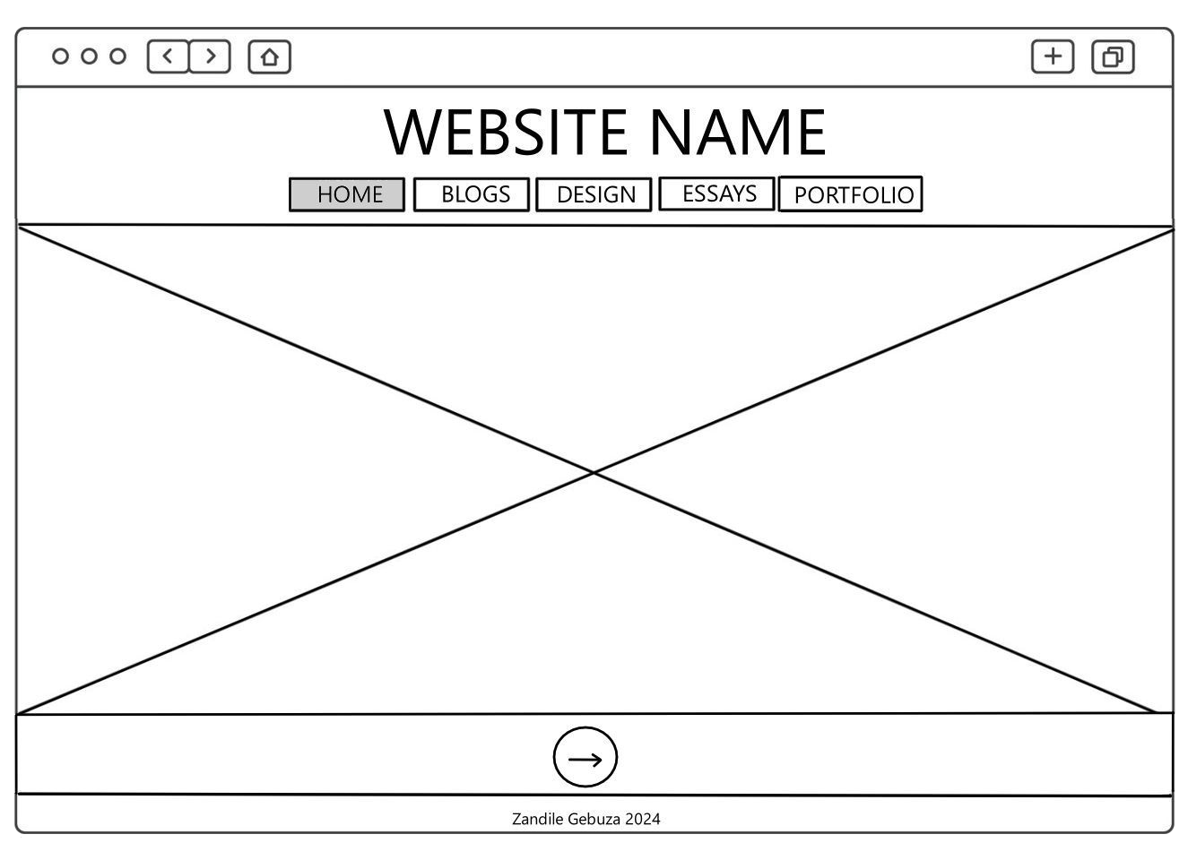
For the desktop version, I kept the same structure as the original draft. I just made these much neater and I used wireframe-like icons. I also included how the website pages will look on a web browser (the URL bar at the top of the page) and the page footer.The box with a cross represents an image that I will use for the homepage. The currently active page will be greyed out so that the user knows what page they are on.
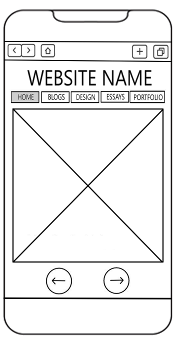
The mobile version is also the same as the original. I added a browser view and a footer to show exactly how it should appear on a user's phone. Like the desktop version, I added these changes because it was a bit hard for me to visualise what my website could like. Having to URL bar and footer lets me know exactly where on the page things should go and it also helps with the sizing. This is because some elements look larger in the draft and if I didn't make any revisions, I wouldn't have known that they need to be scaled down or completely removed.
Original Blog Page
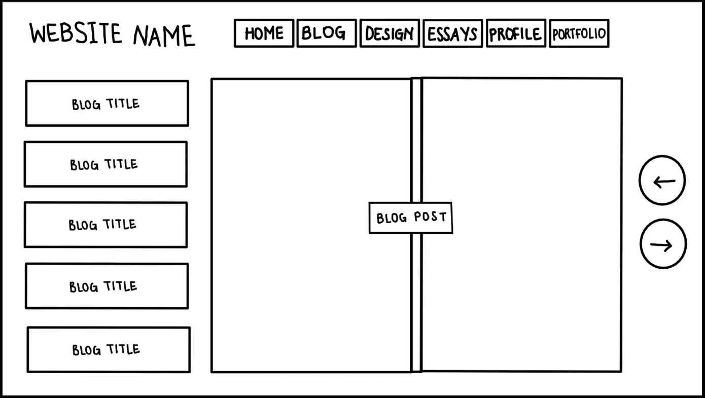
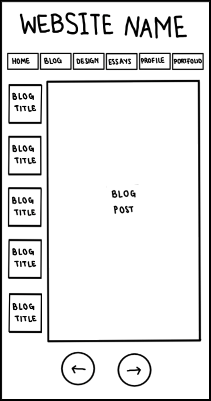
The blog page will have the website name at the top left corner and a navigation menu at the top right/middle. On the left side of the page there will be links to other blog posts. The middle of the page will be the blog post that is currently opened (It will be made to look like the pages of a book hence there are two pages and a divider in the middle). On the right, there will be buttons to go back to the previous page or the next page.
A mobile version of the blog page would have most of the same structure as the desktop version. Howvever, instead of the blog appearing as two open pages of a book, it will be one so the user will be able to flip the page by swiping on their screen from right to left. The back/next buttons would also be moved to the bottom of the page to accomodate the blog.
Final Blog Page
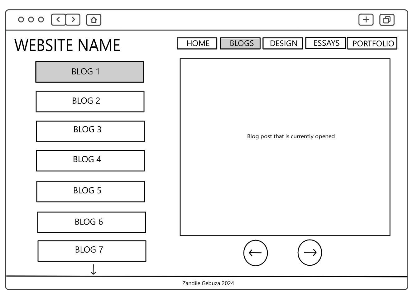
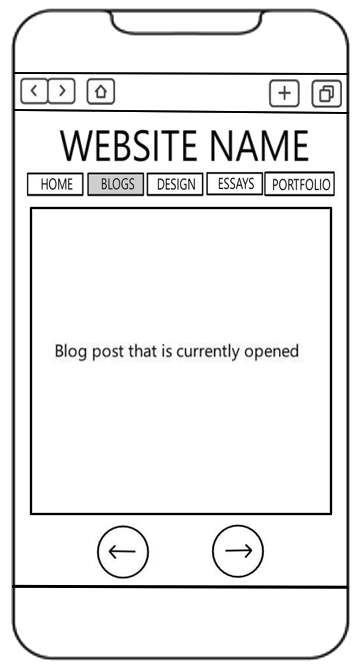
Both the desktop and mobile versions are different from the original. I first wanted to make the blogs to appear as book pages so two pages would be in view. However, I decided to remove that because the blogs aren't that long to require two pages. I also removed the buttons from the right side of the page to be at the bottom. This is so that all my pages are consistent and I wouldn't want to surprise the user with the buttons being at an unfamilar location.
For the mobile version, I removed the list/tabs of other blog posts. There are already buttons to go to the next page so it would be unnecessary to have those other blog tabs. Also, in terms of the spacing on the page, it is much neater if the tabs are removed.
Original Design Page
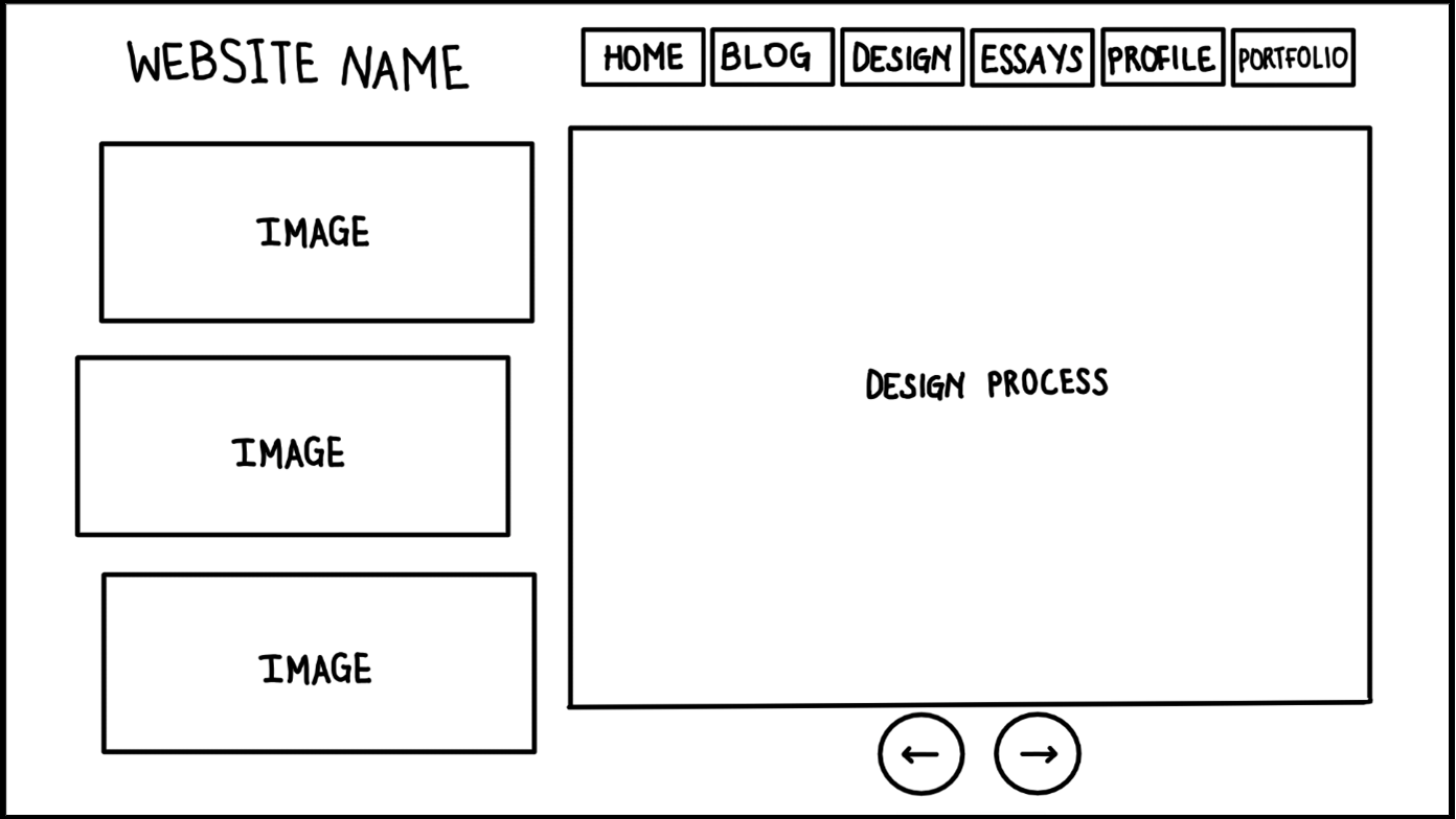
This is the structure for all the design pages (wireframes, IxD, and the style guide). The design pages will have the website name at the top left corner and a navigation menu at the top right/middle. On the left side of the page there will be images related to the topic written about in the middle of the page. Below it will be buttons to go back to the previous page and the next page.
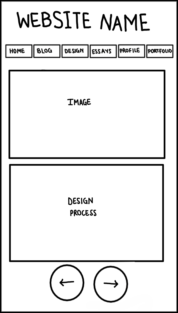
A mobile version of the design pages would be structured a bit differently. The images would be placed at the top of the page after the menu then the paragraphs related to it would be placed below it. The buttons would stay at the bottom of the page.
Final Design Page
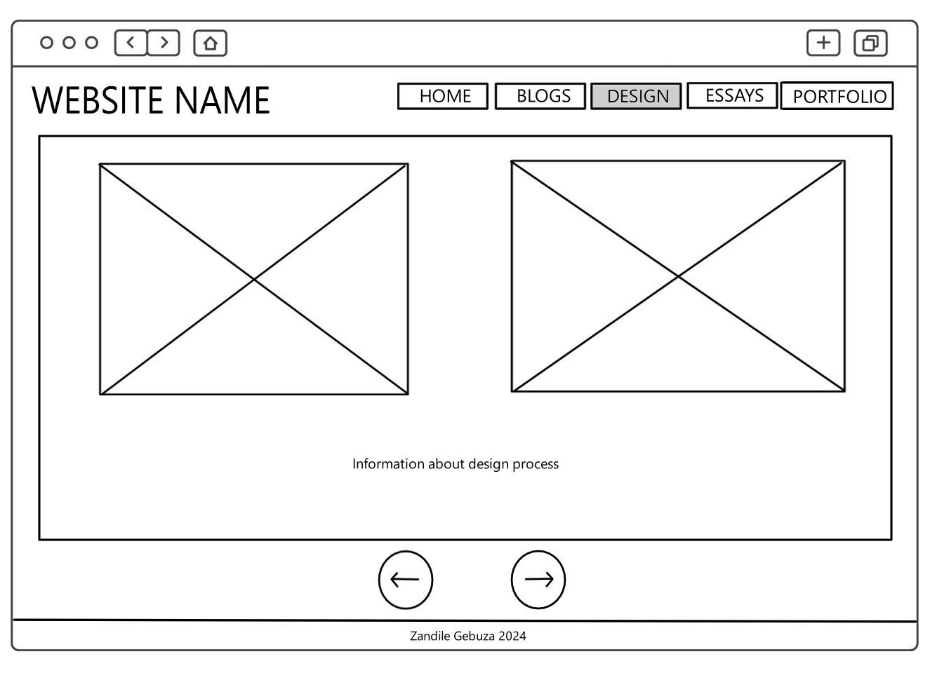
For the desktop version, I removed the images from the left side to the middle of the page. This is because I probably won't have a lot of images but I will have a lot of paragraphs so I wouldn't want my images to remain at the top of the page while the words continue down the page.
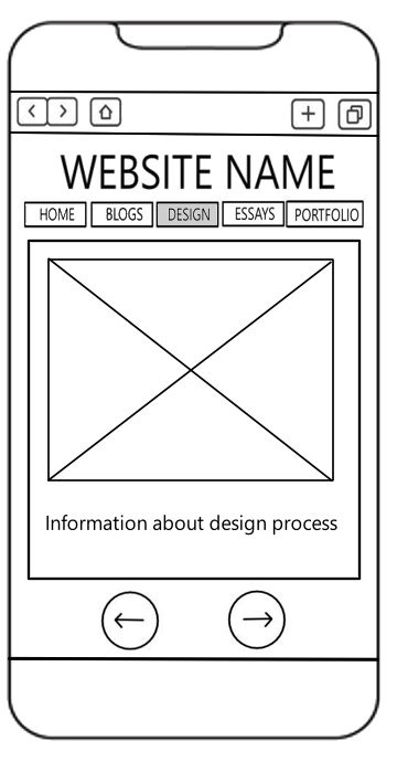
The mobile version is the same as the original structure, just drawn neater and more accurate.
Original Essay Page
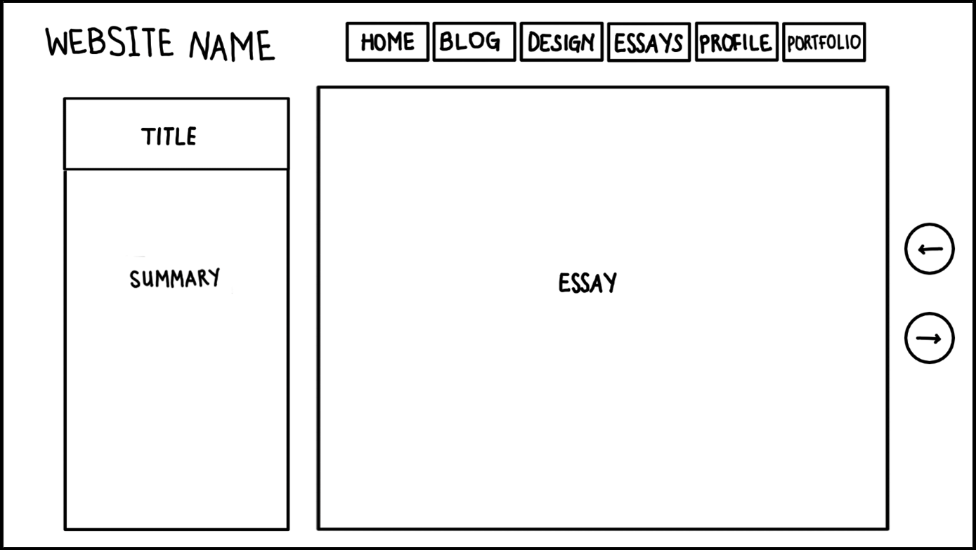
The essay page will have the website name at the top left corner and a navigation menu at the top right/middle. On the left side of the page will be the title of the essay as well as a summary. The essay will be in the middle of the page then the buttons will be placed next to it on the right.
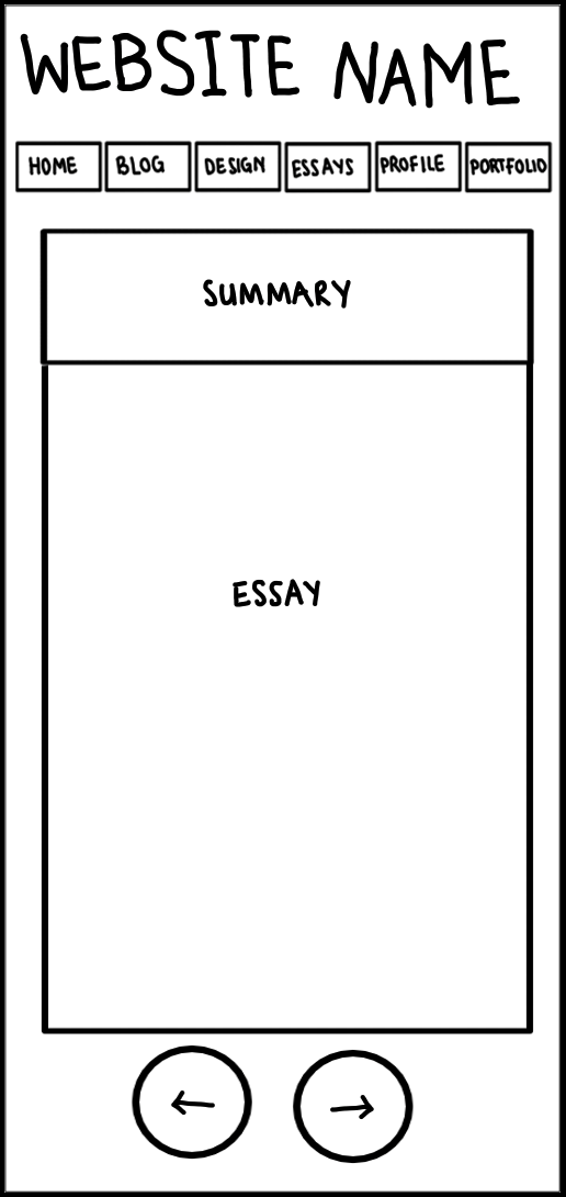
A mobile version of the essay pages will have the title and a summary at the top of the page. Then below it would be the essay and the buttons.
Final Essay Page
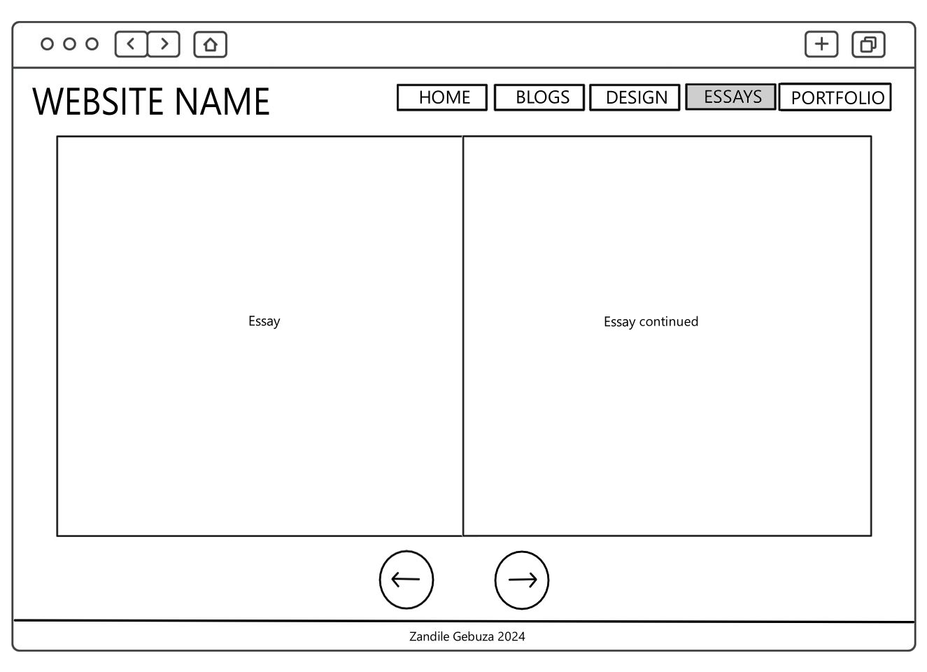
For the desktop version, I used the book page idea from the blog posts. Each essay will appear as pages in a book. I also removed the summary section because I did not think it made sense to include it in the same page as the actual essay.
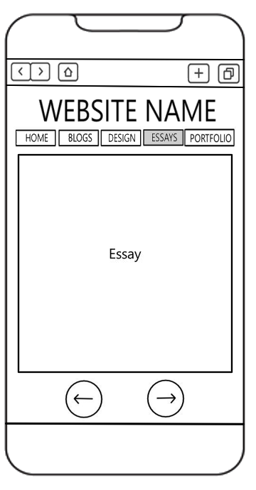
For the mobile version, I removed the summary tab but everything remains the same.
Original Profile Page
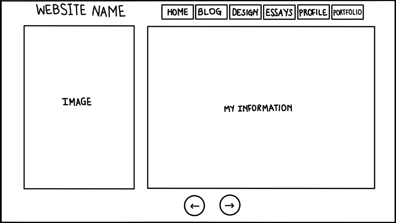
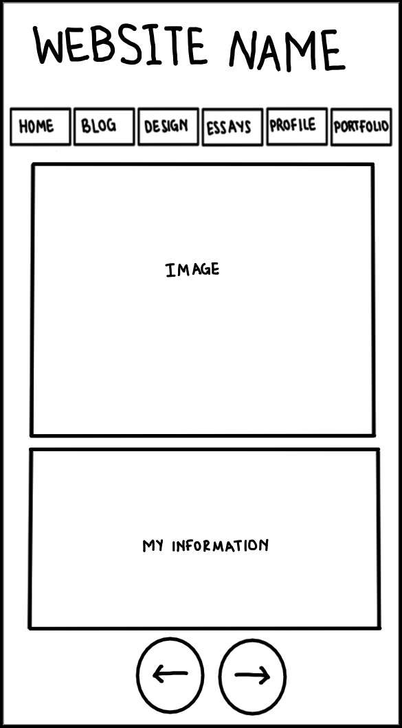
The profile page will have the website name at the top left corner and a navigation menu at the top right/middle. On the left there will be a picture of myself and in the middle there will be paragraphs with my information. Below this there will be buttons to go back and to go to the next page.
Like the design page, a mobile version of the profile page will have an image at the top and information at the bottom. The buttons will remain at the bottom of the page.
Final Profile Page
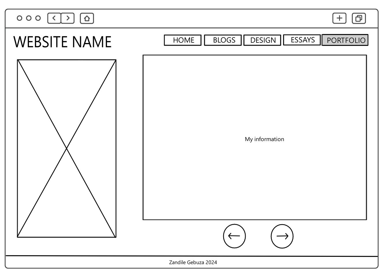
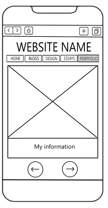
Both the desktop and mobile versions are the same as the original.
Original Portfolio Page
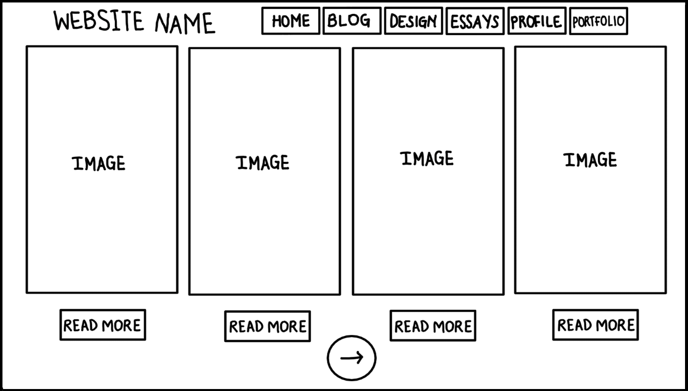
The portfolio page will have the website name at the top left corner and a navigation menu at the top right/middle. The large rectangles represent screenshots of my artworks, digital art, games, and animations. Below them will be "read more" buttons for users to see more information about the art as well as a button to go to the next page. The next page will be another page of works. I want to have one page for traditional art, another one for digital art, and a third one for my games. Because the Portfolio pages are last in the sequence of the website, the last portfolio page will have a button that takes the user back to the Homepage.
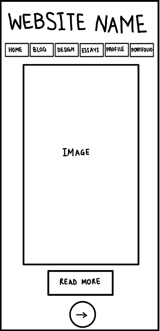
A mobile version of the Portfolio page will show one panel at a time. Each one will take up the whole space on the screen so to go to the next panel, the user will click on the next button.
Final Portfolio Page
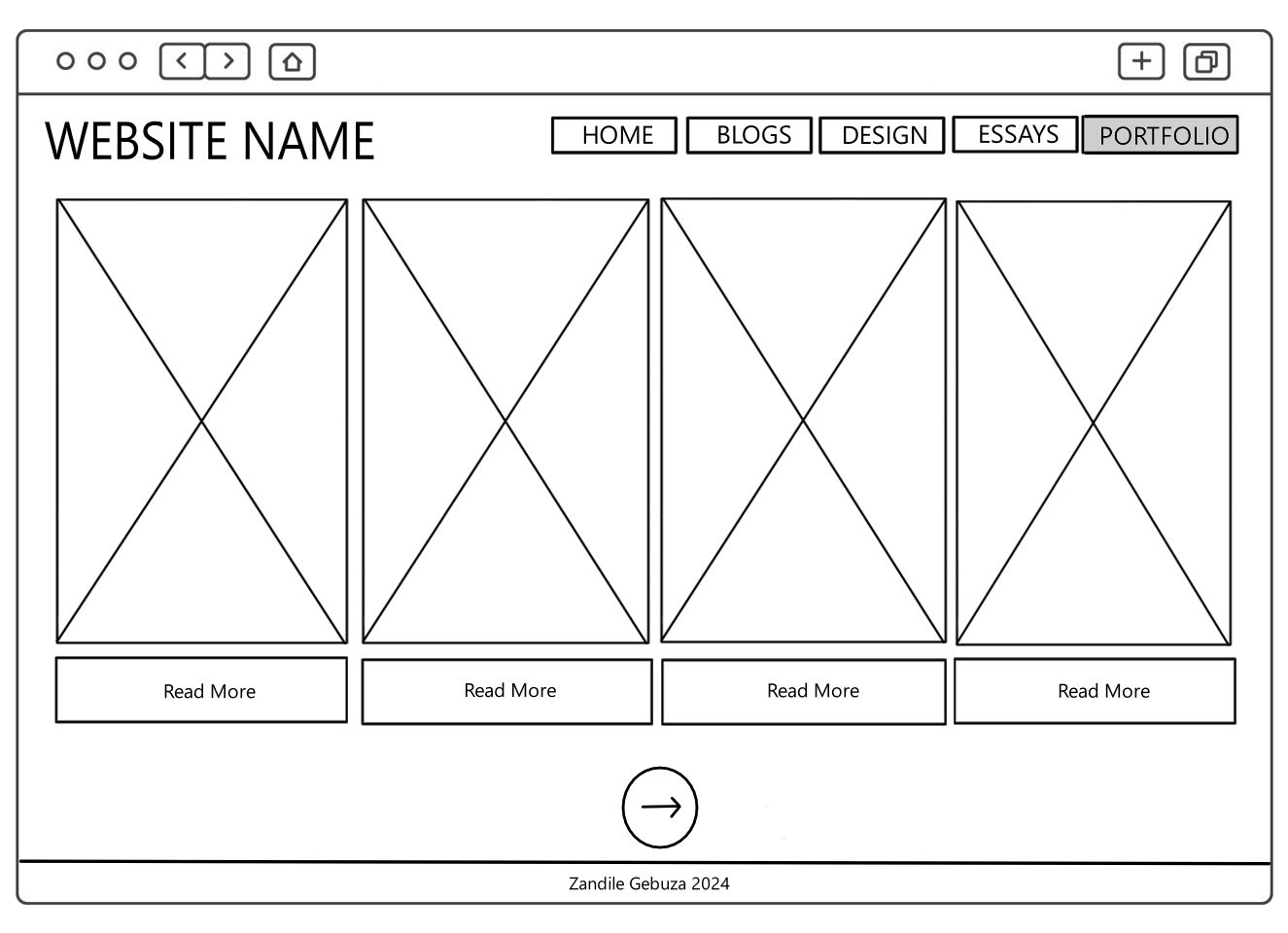
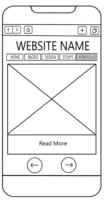
Both the desktop and mobile versions are the same as the original.