User Alignment
- My goal is that I want my website to be innovative, functional, and aesthetically pleasing. Even though it might have familiar features, I want people to find my website unique. I want them to find it easy to use and for every aspect to work the way I planned it to. And the most important thing is, I want them to see it as organised and creative.
- I want people who view my website to look at the way I structure my pages and the colour schemes I use and see it as familiar. But, I also want them to be impressed at the little breaks of convention that I will use to make my website creative and unique. I want my users to explore every single page, hyperlink, and tab that I use on my website. This is so that they have the full experience and they see all the work that I put into it.
- My target audience, for now, is our lecturer for this course. I know that she has access to a computer and has experience in web development so she will be able to view my website and when some things don't pan out the way I wanted them to, she might be able to figure out what went wrong. Eventually, my target audience will be potential employers in the industry of animation ad web development. This will be my new target audience because when applying for jobs, I will need to submit my CV and portfolio so they would need to see my website. This means that I have to modify my website, check it for errors, and make it ready to submit for applications and interviews.
- I assume that potential employers won't have a lot of time on their hands so the website has to be easy to navigate, functional, and aesthetically pleasing. This is because when the website is easy to navigate, it won't be difficult to view it, when it is functional, they won't have any issues or have to send me emails requesting a functional website, and when it is aesthetically pleasing they will see that I am creative person. Potential employers, I also assume, want to see who I am as an individual and how I differ from other applicants so I will make sure that my profile page is very detailed and that my portfolio page is a representation of my best work.
Interface Elements
- Input controls: I have added a text field with a submit button for users to leave me a message or contact me. This is located at in the Profile page. It doesn't actually receive any messages because I learnt that such is done through PHP. I don't know how to use PHP code so I didn't want to waste time learning how to do it when it is not required for the exam. However, I will learn how to use PHP when I start using my website outside of the course.
- Informational Components: I have added pop-up message that appears in the different homepages for each section. This message informs the user that the section images/cards are clickable. When clicked, it opens the page to that section.
- Navigational Components: I have added a reading progress bar at the top of the blog pages. This shows the reader how far they are in reading the blog post.
Information Structure
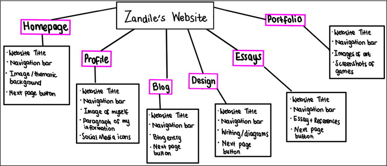
This is an image of all the information that I want each page to include.

User Flow Diagram

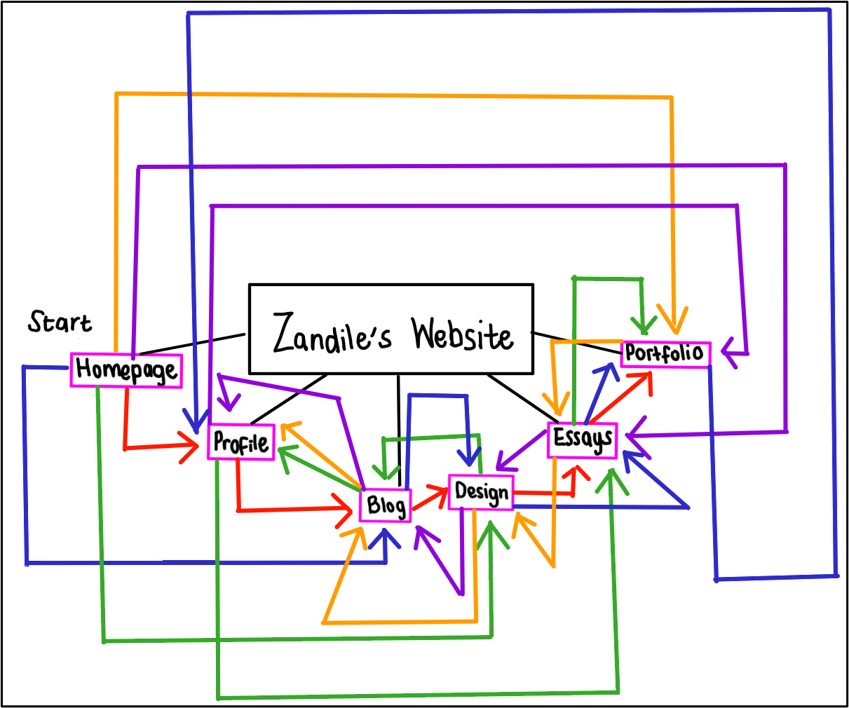
My user flow diagram has arrows to show where the user might flow to after reading the information on each page.
Interaction Points
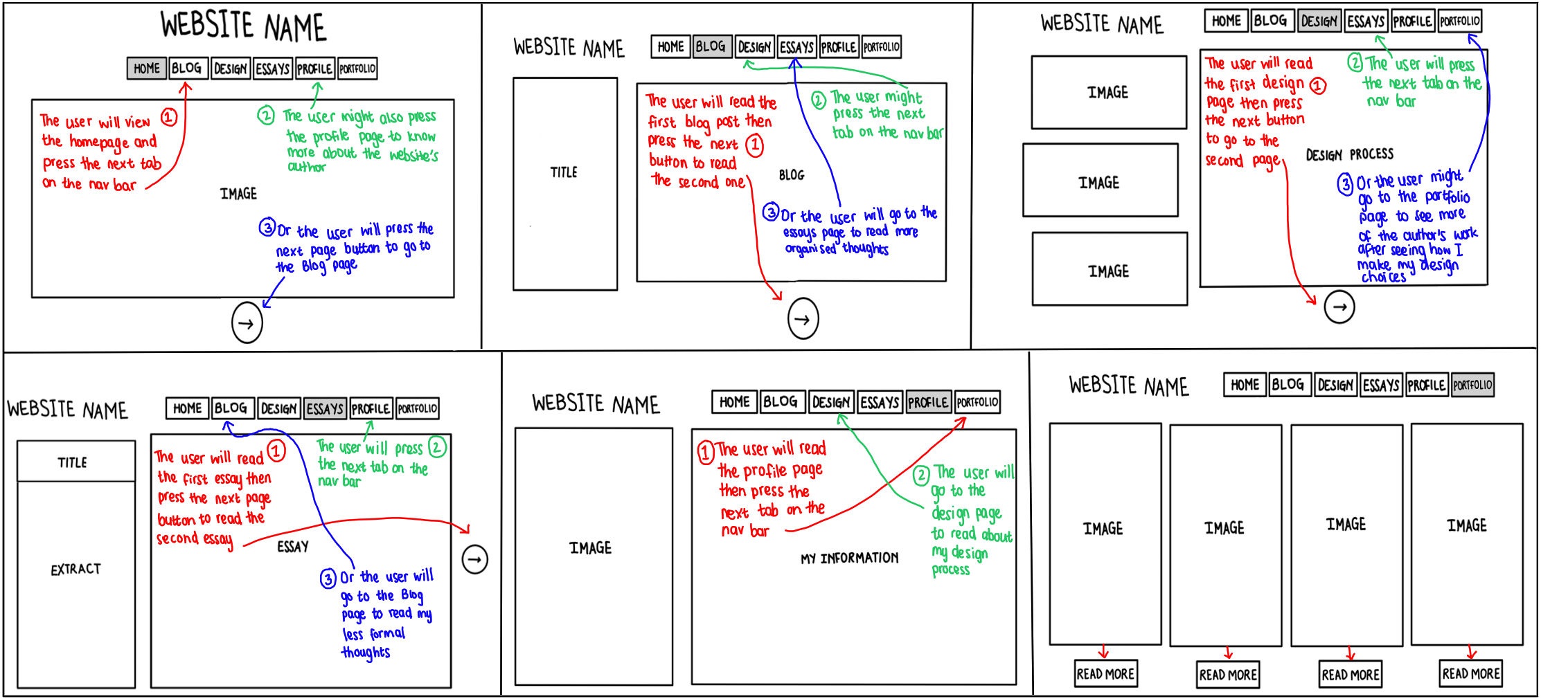
I want to push the user to use the next button as it will take them to the next page of an essay, or blog or an entirely new tab. However I do know that some users might not want to read all my blogs or essays so they still have an option to use the navigation bar at the top of each page to go to the section of their choosing. I am teaching users that each page has a navigation bar and next button so they can go through the website in its entirety or they can go through it however they want.
