My goal and aesthetic
I want my website to look bright but not in a glaring way. I also want it to feel friendly but also professional. That is why I am using pastel colours and my buttons will be a mixture between being circular and having rounded edges. The background colour, navigation tabs, and button colours will also be consistent on every page.
Colour Palettes

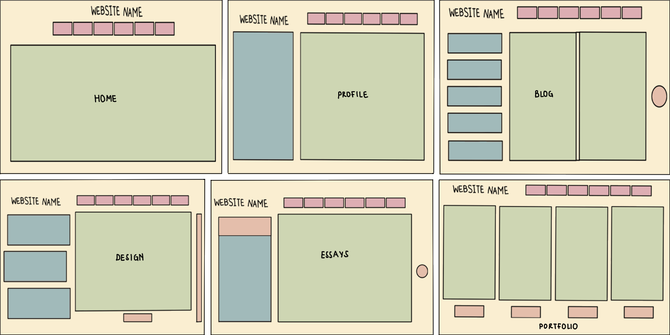
This is the colour palette that I might use for my website. I got this image from the internet and I chose it because it has hex codes which will be useful for CSS. I chose this palette because the colours look good next to each other and because I just love pastels. Pastel colours make me feel calm and when I see people wearing pastel colours I perceive them as friendly/happy. Therefore, I am hoping that using them in my website will give off the same impression.
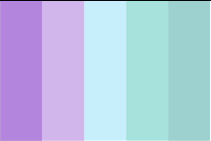
This is colour palette that I have used for the final design of my website. I chose these colours because purple is my favourite colour and the others from the palette complement it really well. I also know that pastel purple is a calming colour so it works well for the feeling of calmness that I want to evoke. I have also incoporated some of the colours from the previous colour palette such as the tan colour, the light orange, and the pink. This is because I didn't want to only use purples and blues as it might have been too overwhelming.
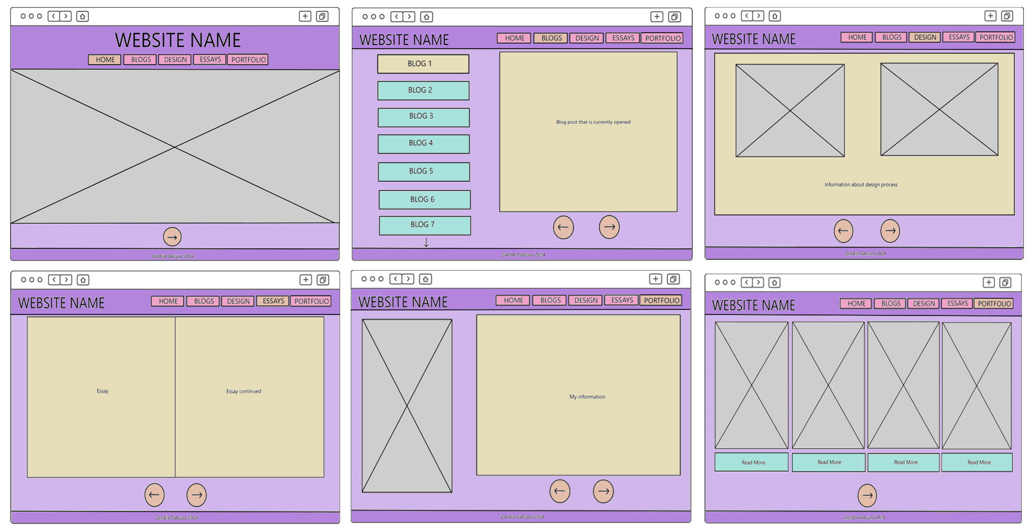
As seen in the image above, the main colour for my website is purple, the secondary colour is tan, and the tertiary colours are blue, orange, and pink.
- Dark purple is used for the headers and footers and light purple is used as each page's background colour. I coloured these sections in this way to make the pages balanced. Having a dark background at the top and bottom of the page and a light background in the middle creates a dark-light-dark pattern that is pleasing to the eye. This is a pattern that is common in the designs of different websites and objects that people use everyday. So, having it in my website might create a sense of familiarity in the user.
- Tan is used as the background colour for large sections of text. This is because the colour is light and bright so it pairs well with the dark text colour. Also, it means that users won't have a hard time reading my work as they would have if I left the background as purple.
- Pink is used for the nav menu buttons while orange is used for the "next" and "back" buttons as well as the currently opened nav menu section. The nav menu buttons are pink because it goes well with the purple background colour. The currently opened nav menu section is orange because it goes well with pink. Apart from that, I just wanted to use a different colour to show the user what page they are currently on, and this will help them to not do extra work to know where they are in the website.
- Finally, blue is used for the blog tabs/buttons as well as the "read more" sections in the Portfolio page. I chose this colour for these sections because it pairs well with the background colour but also because these sections are unique. Besides the Blog page, no other page has tabs on the left side of the page. Also, besides the Portfolio page, no other page has a "read more" section. This makes them stand out and shows the user that they are important.
Button Shapes
As seen in the image above, my website has two types of buttons, a circular one and a rectangular one with rounded corners. Circular buttons are used for the "next" and "back" buttons and the nav menu buttons have rounded edges. I chose these button shapes because they help convey the feeling of friendliness that I want users to feel when they are on my website. Straight corners would have made my website feel too serious and they would not have complemented the pastel colours and artsy feeling that the website has.
Text Alignment
- I want my website name to appear at the top left of all my pages besides the homepage. This is just a way to put the title on the left so that the user focuses on the other parts of the page. The headings on my all pages will also be alighned to the left.
- My homepage's website name will be aligned at the center of the page. Because this alignment is not recommended for longer text, I want to use it for the title of my website as well as the nav menu. Also, I have seen some websites that use centre alignment for the homepage that I found visually appealing, so I'm hoping it will be the same for mine.
- All the content in my webpages will have justified alignment. This is because it makes the work look neat and easy to read.
- My navigation menu will be right-aligned for all my pages besides the homepage. This is so that it doesn't collide with the website name and it also makes the page look visually appealing.
Font Styles
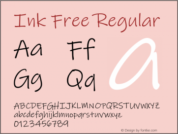
This is the font style that I have chosen for my website title. I chose this font because it is one of my favourite fonts to use for any creative, digital work that I do.
I also chose it because it looks really great for decorative text but not for large sections of text. Most importantly, I want my title to stand out from the rest of the page, so I figured that
it would be more suitable to use this font for that and then pick a more readable font for paragraphs of text.
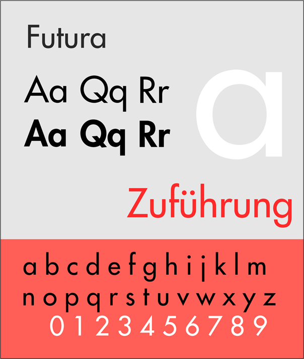

This is my chosen font style for all the paragraphs of text in my website. I got this image from the internet and I like that it shows how the font looks when typing different numbers, letters, and symbols. I chose this font because according to Google, Futura is in the top 10 of fonts that are legible and readable. Below I have included screenshots of some websites that use this font.
Inspirational websites
These are some websites from artists that are inspirational to me, as a creative, as well as others that inspired me in terms of the look and feel that I want to invoke in my website.
April Ford
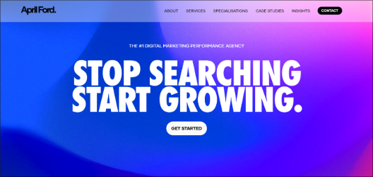
I really like the April Ford website because it uses a limited colour palette, it has incredible structure, and it is easy to use. It consists of 5 colours; black, white, blue, purple, and grey and each colour has a purpose. Important words are styled in blue, text is written in black, the background is white, the banners are purple and images are grey. This shows users that there each colour is significant in different ways. The website has a balanced layout which is very pleasing to the eye and the font they used is readable and legible.
Donuts
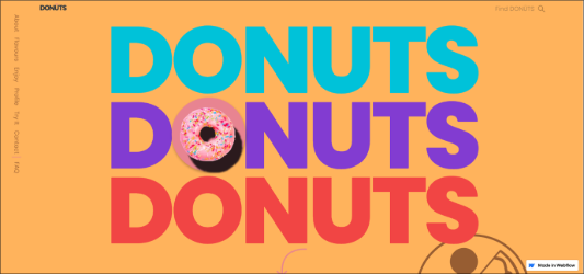
I also like the Donuts website because of its use of colour and layout. They used a wide range of pastel and solid colours and they compliment each other very well. The website is structured as one continuous page but with each scroll a new element is introduced. I found this interesting because, in theory this would be overwhelming but I found it visually satisfying. The layout is mixture of balanced, asymmmetrical, and radial. The font is also readable and legible.
Yulia Ruditskaya

I like how Yulia Ruditskaya's navigation tab shows viewers which page they are on by italicising it. This can be seen in the image on the left with the word "Reel" being in italics and the rest of the tabs being in normal text.
Natalie Rose Young
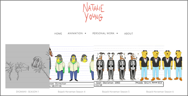
I really enjoyed seeing Natalie Rose Young's work because I have watched some of the animated shows that she has drawn characters for. However, I did not find her website interesting. I feel as though it is something
that anyone could make so it lacked in creativity. This is something I assumed she would excel at given her impeccable character designs and artworks. For instance, the background is white and it could have been better
with a bit of colour or some patterns. Another thing is that her drawings do not have descriptions, she just put pictures without any context about them or their significance.
Rafael Varona
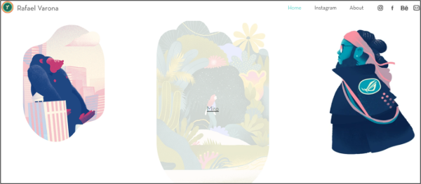
I like how responsive Rafael Varona's website is. When a viewer hovers over an artwork, it gets greyed out and a link appears to show that they can read more about it. This makes the website interesting and shows the
user that it is interactive.
Alison Donato
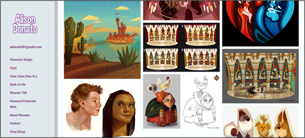
Unlike all the other websites I have seen, Alison Donato's website has a left-side panel as a navigation bar. Instead of scrolling up to change the page, the viewer has all they need from this panel and it might make their experience of the website better. I found this very interesting because it kind of broke the convention of what I know websites to be. However, it gave a unique user experience, which is what I want to do for my users.
Ana Leovy
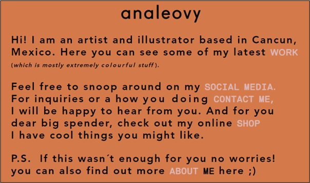
I like how simple and straight-to-the-point Ana Leovy's homepage is. She didn't fuss about adding an image or pattern for the background but instead chose to use the colour orange and it is simple but appealing to
look at. Also, when viewers want to explore other parts of her website they can click on the links in the light grey text. This is a very unique way to design a homepage but it also interesting, functional and readable, and usable.
