Design Process
Take a peek behind my design process, from the spark of inspiration to the final flourish of completion.
My goal
The overarching goal of my website is to present my skills, experience, and work to engage with my audience meaningfully. It serves as a digital portfolio that showcases my expertise in interactive media and game design, aiming to captivate potential employers, collaborators, and those interested in the field.
Visibility: I want visitors to see a curated selection of my best work, laid out in a way that's easy to navigate and understand.
Action: I want visitors to interact with my content, whether that’s through viewing my portfolio pieces, reading my essays and blog posts, learning about my design process, or reaching out via a contact form for collaboration or inquiries.
Goal Alignment
My User
My target audience includes the following groups:
- Potential Employers: Looking for a clear understanding of my skills, the quality of my work, and my professional approach.
- Collaborators and Peers: Interested in viewing my work for potential collaborative projects or professional networking.
- Aspiring Professionals and Students: Seeking insights and inspiration from my design process and my body of work.
- Motivation: Users visit my website to evaluate my capabilities, find inspiration, learn from my design process, or contact me.
My Content
My website contains diverse content, including:
- Portfolio Items: Visual showcasing of my work.
- Blog Posts and Essays: Written content that provides deeper insight into my thoughts on design and the interactive media industry.
- Design Process Documentation: Illustrates my methodological approach to projects.
- Professional Biography: Conveys my contact details, personal story, professional journey, and achievements.
- Prioritization: The most important content is what best represents my capabilities and resonates with my professional narrative. For potential employers, this might be my most impactful project and professional achievements. For peers and students, it could be the knowledge-sharing aspect of my blog and essays.
UX
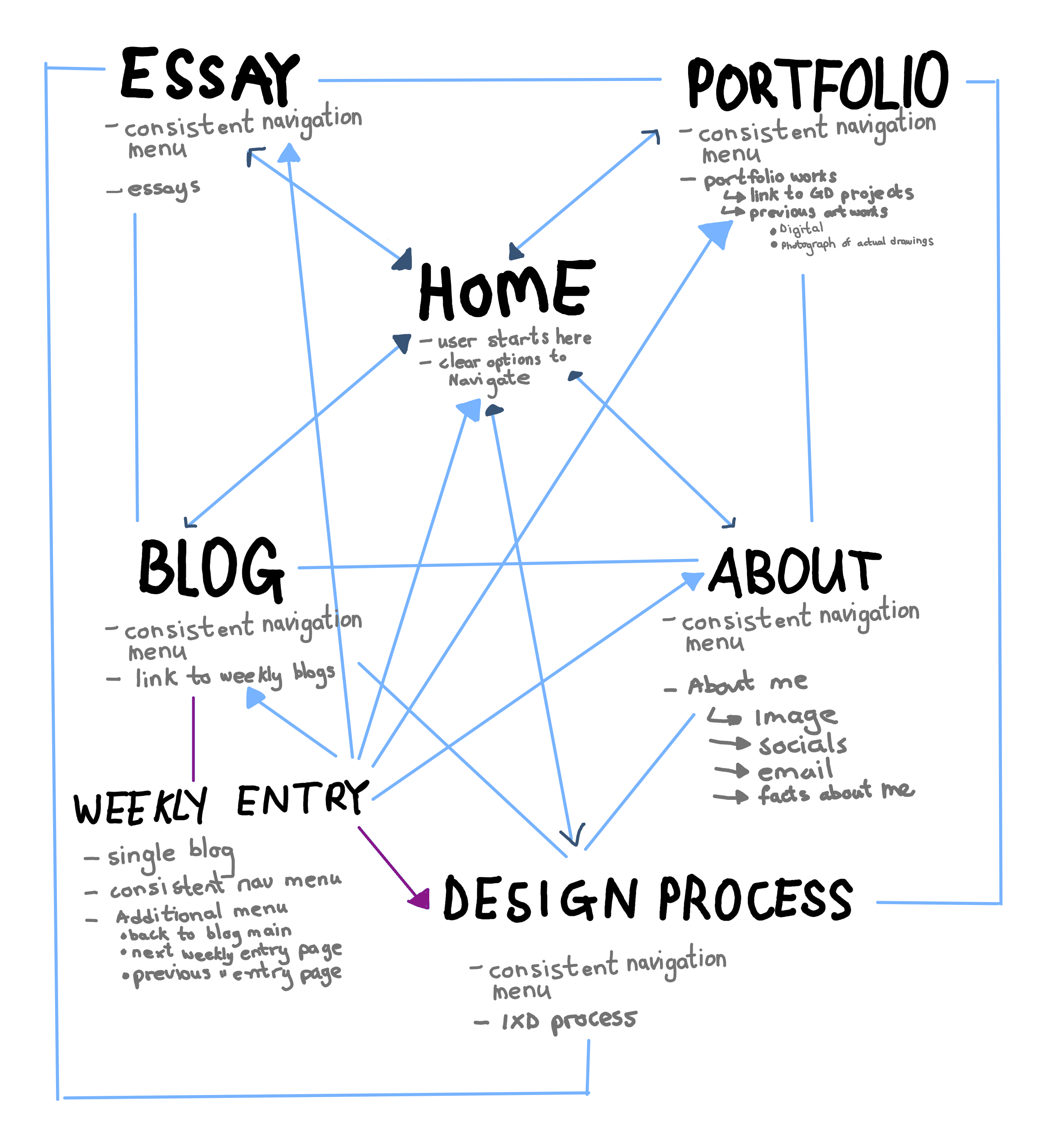
Information Structure
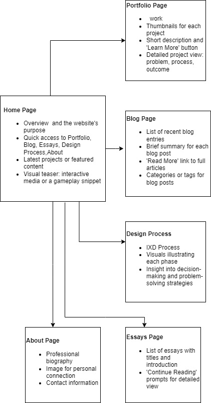
User Flow
Design
Reference Material
The first step in my design process involves brainstorming ideas, researching, and conceptualizing the project.
When looking for references I first looked at a lot of websites for inspiration so I can help design the wireframes for my website but as I continued to design my website, I realized that I needed to design my website to align with my target audience and the purpose of my website. Therefore, I had to revisit references of portfolio websites that have similar goals as mine so I can see how they represent their content appropriately.
The main website I used for inspiration was the one by Rafael.
I found her home page and the consistent navigation menu on each page a good way to allow users to intuitively explore different sections. A consistent navigation menu is key to a user-friendly experience because it helps visitors orient themselves no matter where they are on the site. It's great for keeping the design unified and makes sure users can always find their way to important sections without unnecessary clicks or confusion. Varona's use of a prominent homepage and a persistent navigation menu likely serves to engage visitors right from the start, providing a snapshot of her skills and offerings while ensuring they can easily search deeper into the content. This setup respects the users' time by streamlining their navigation experience and aligns with web design best practices for accessibility and user experience. Other websites I used as inspiration also used a similar navigation technique.
Wireframes
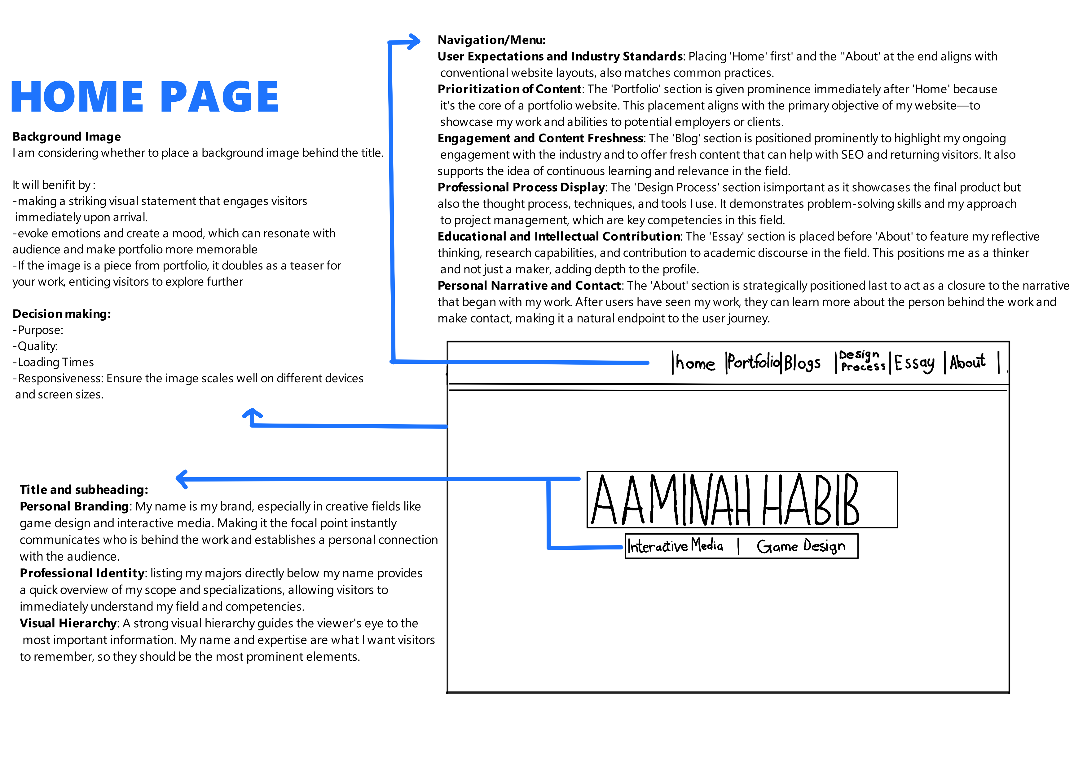
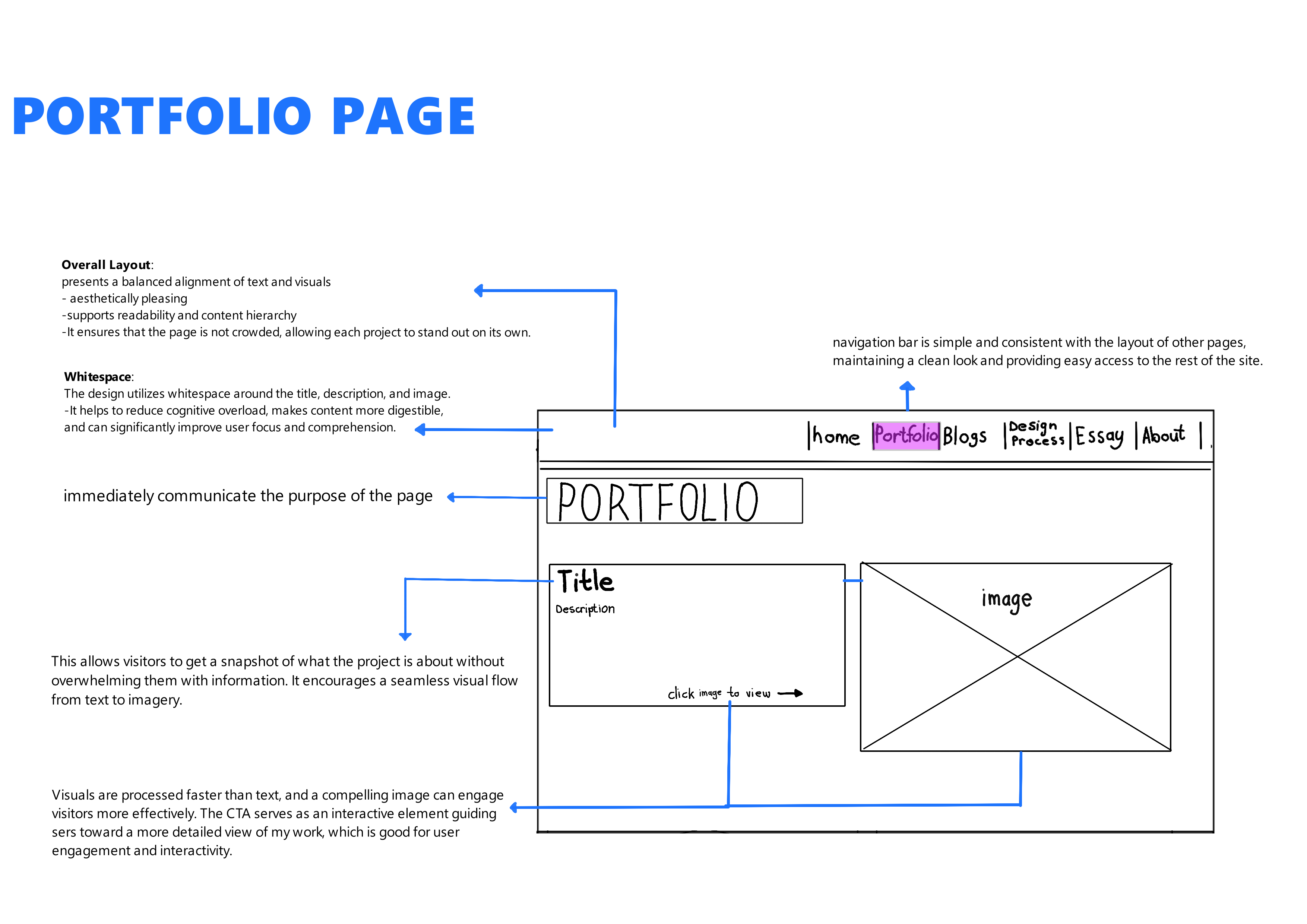
Wireframes of Initial Design
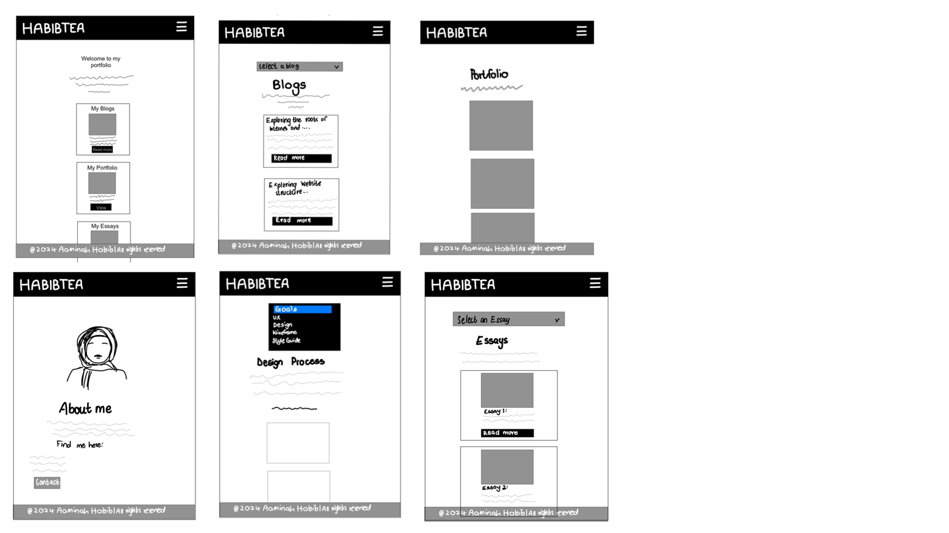
After laying down the initial concept, I begin the development phase where I put together wireframes.
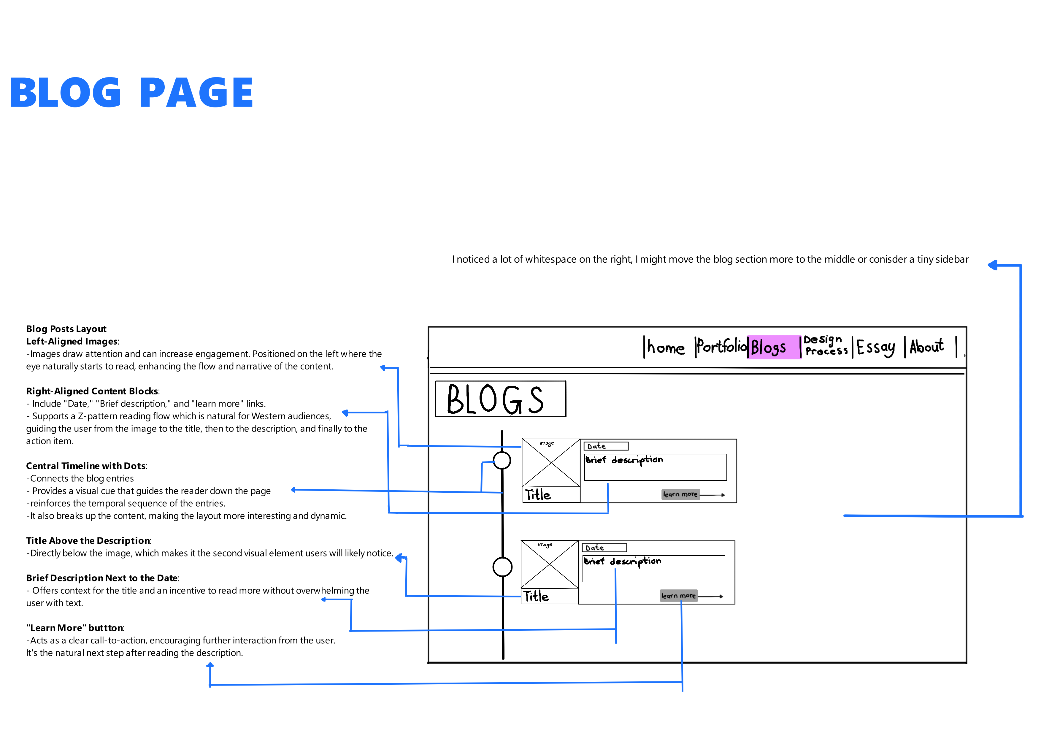
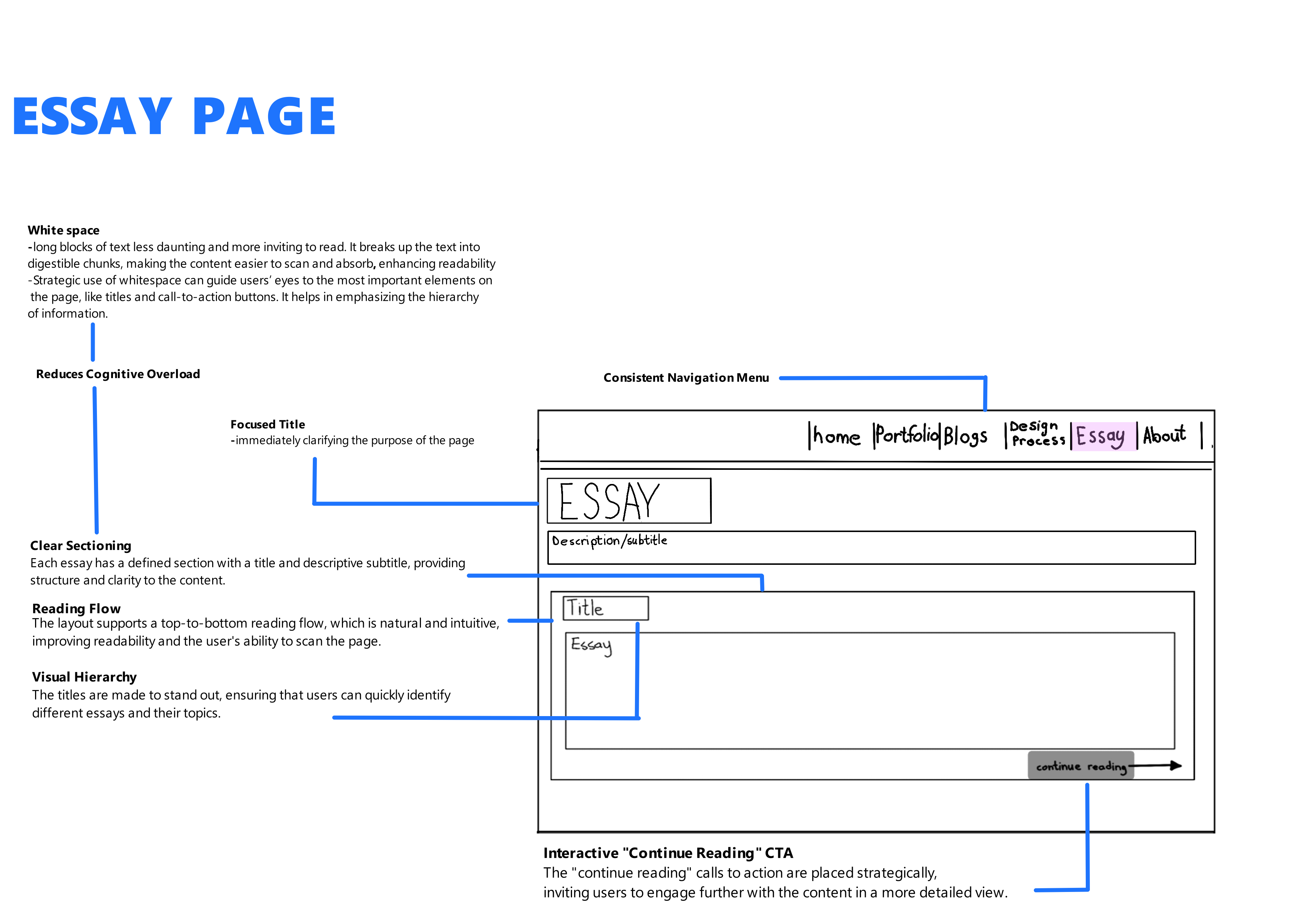
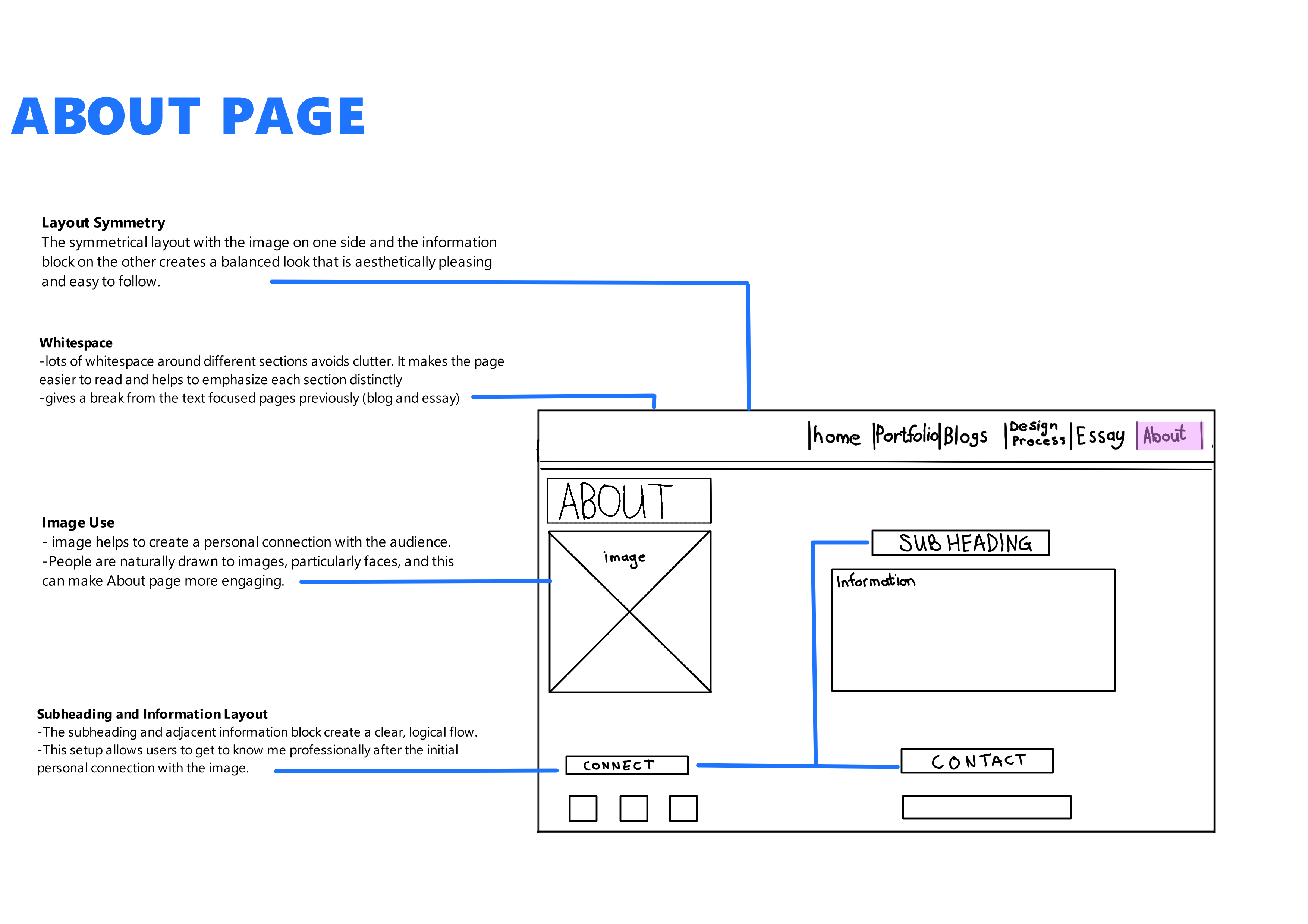
Wireframes for Smartphone Screen Size
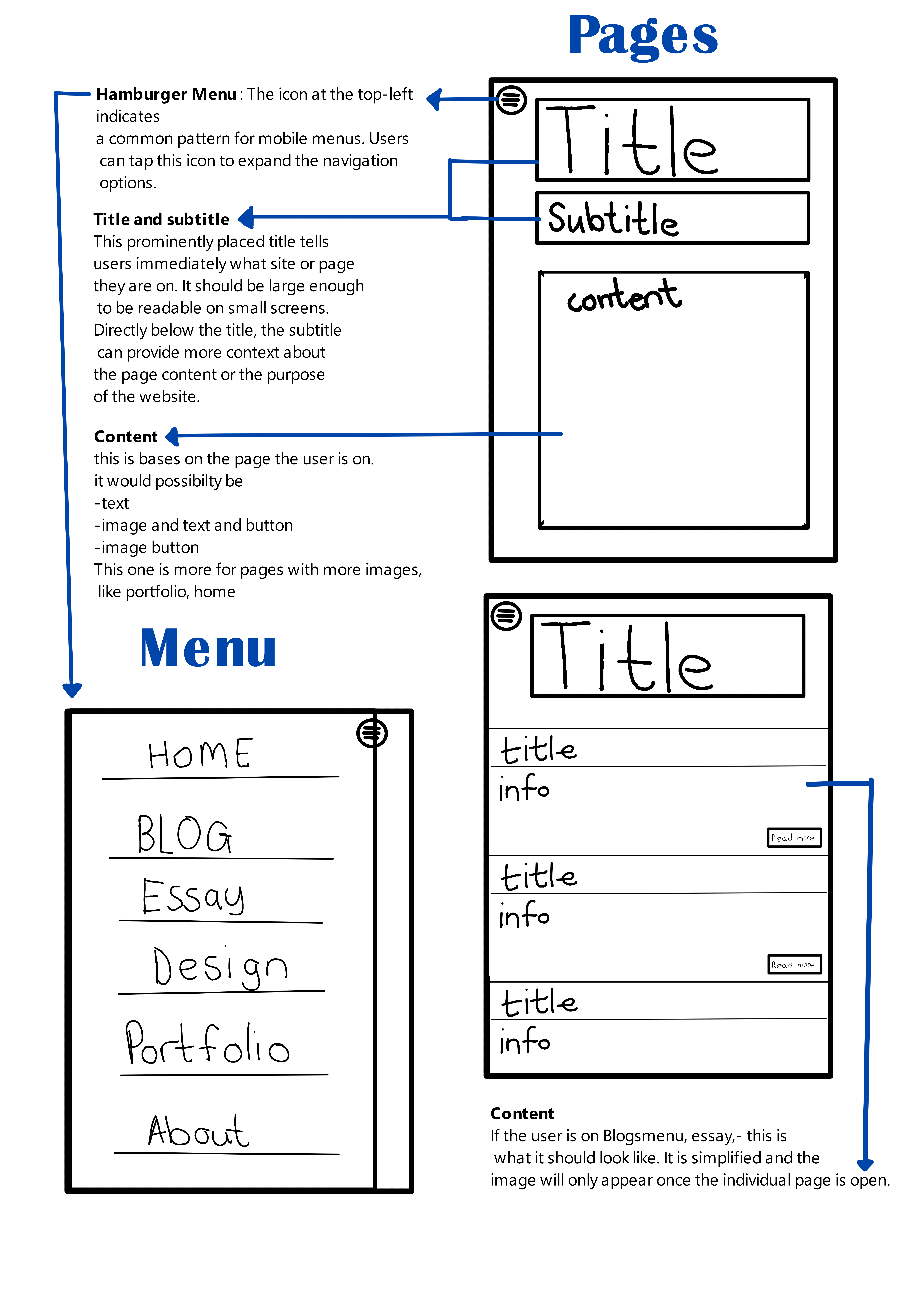
Smartphone Wireframes
For other screen sizes like smartphones, the layout needs to be adjusted. I need to consider that each of these elements should be touch-friendly and easily navigable using a finger on a touchscreen device. I chose to focus my responsiveness on:
- Mobile (small devices), Up to 480px
- Tablet (medium devices): 481px to 768px
- Desktop (large devices): 769px and above
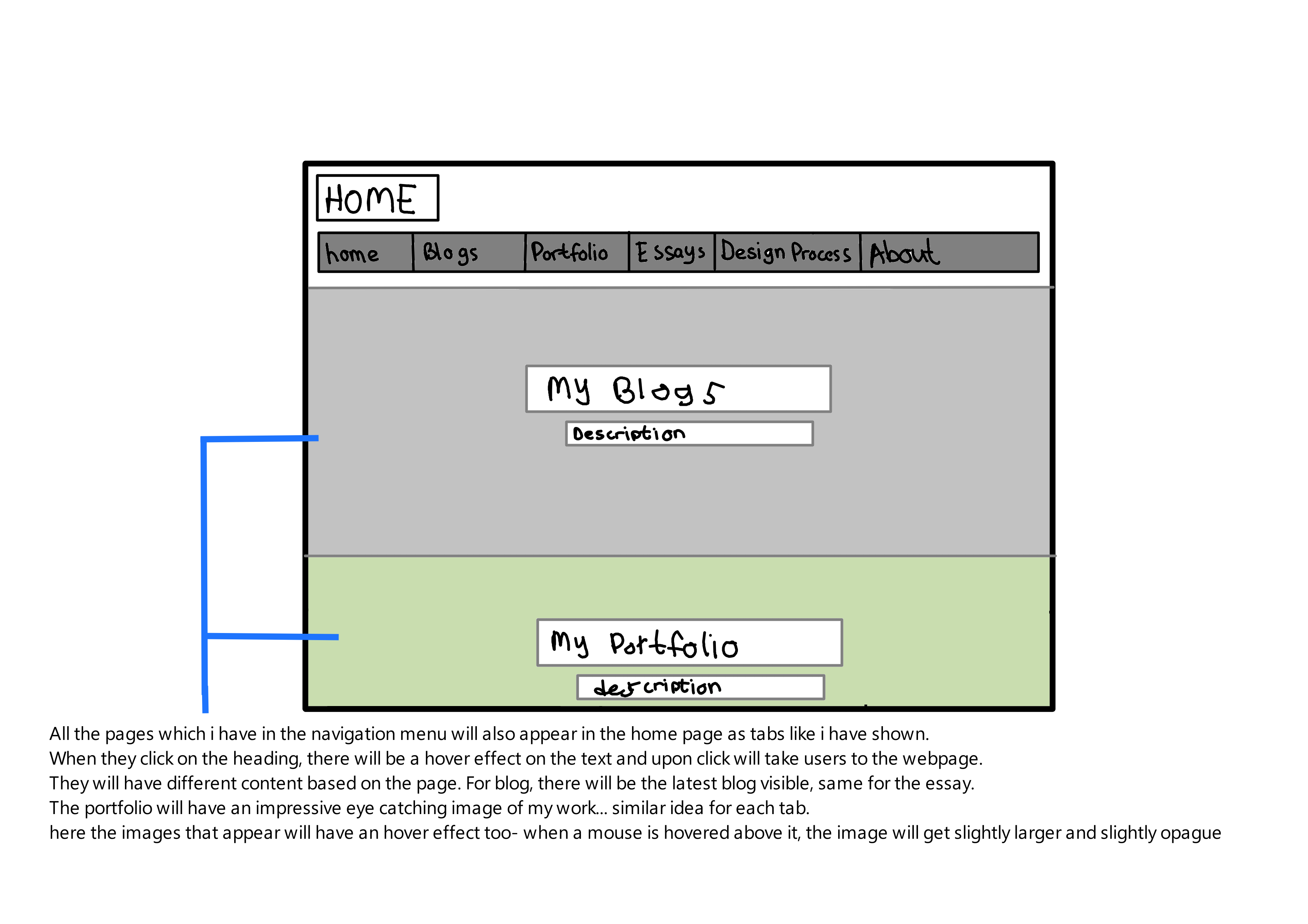
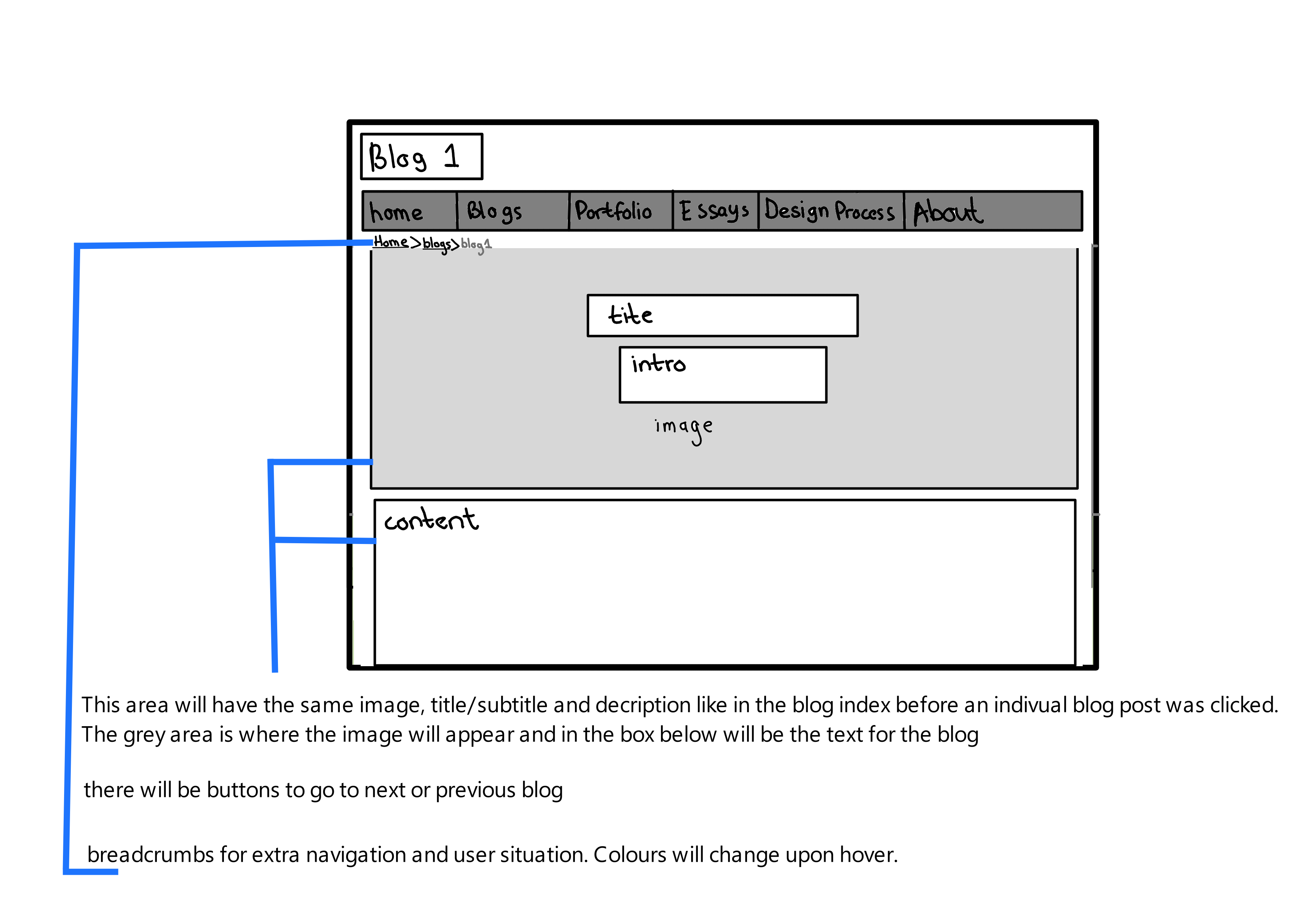
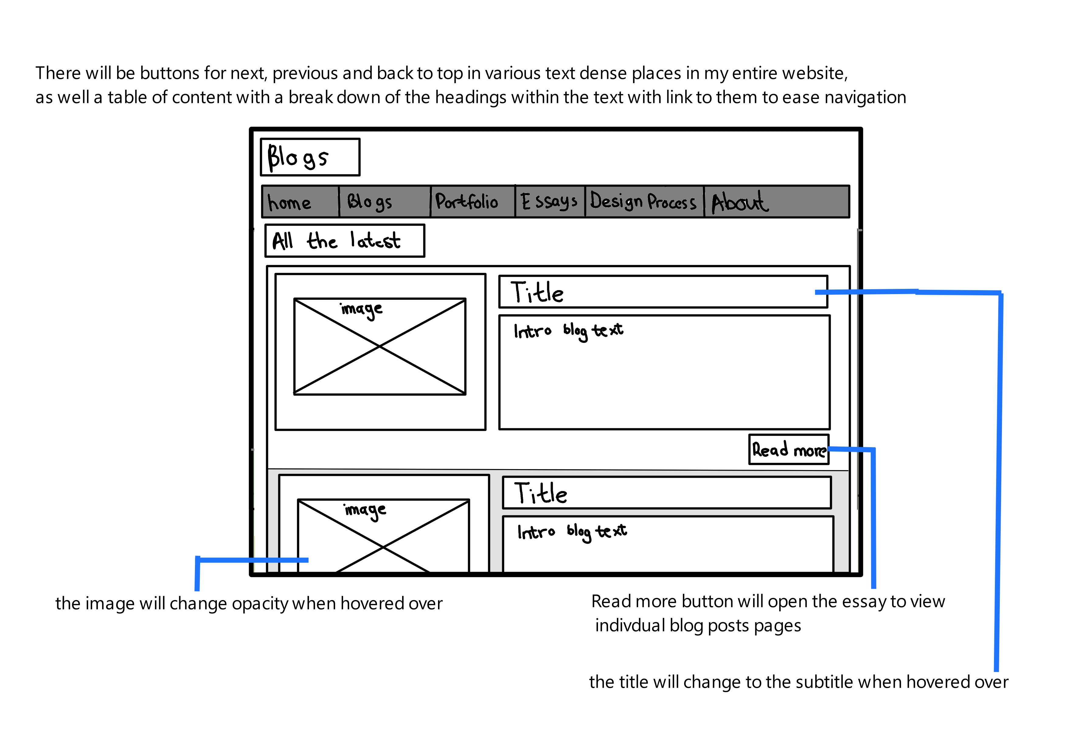
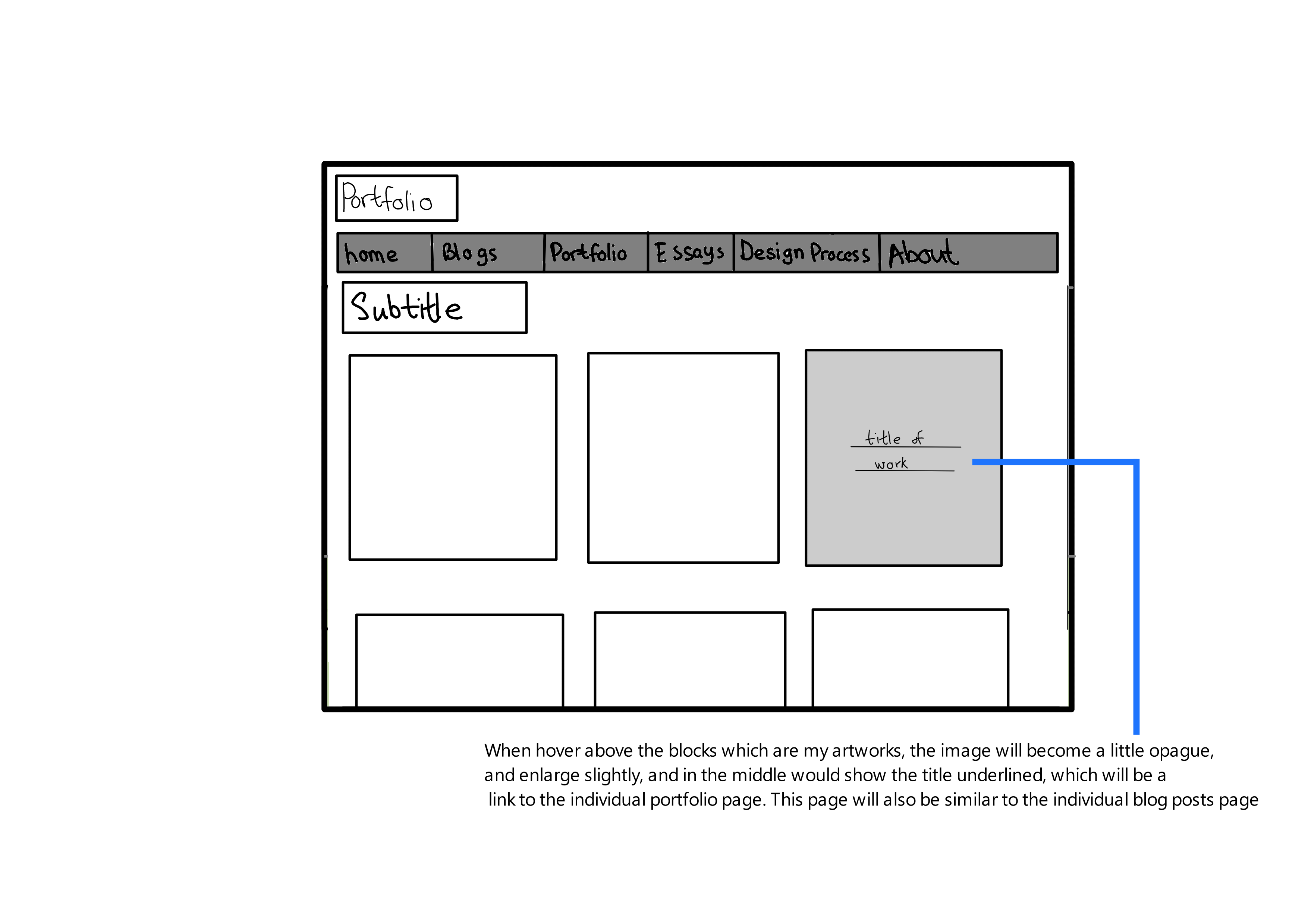
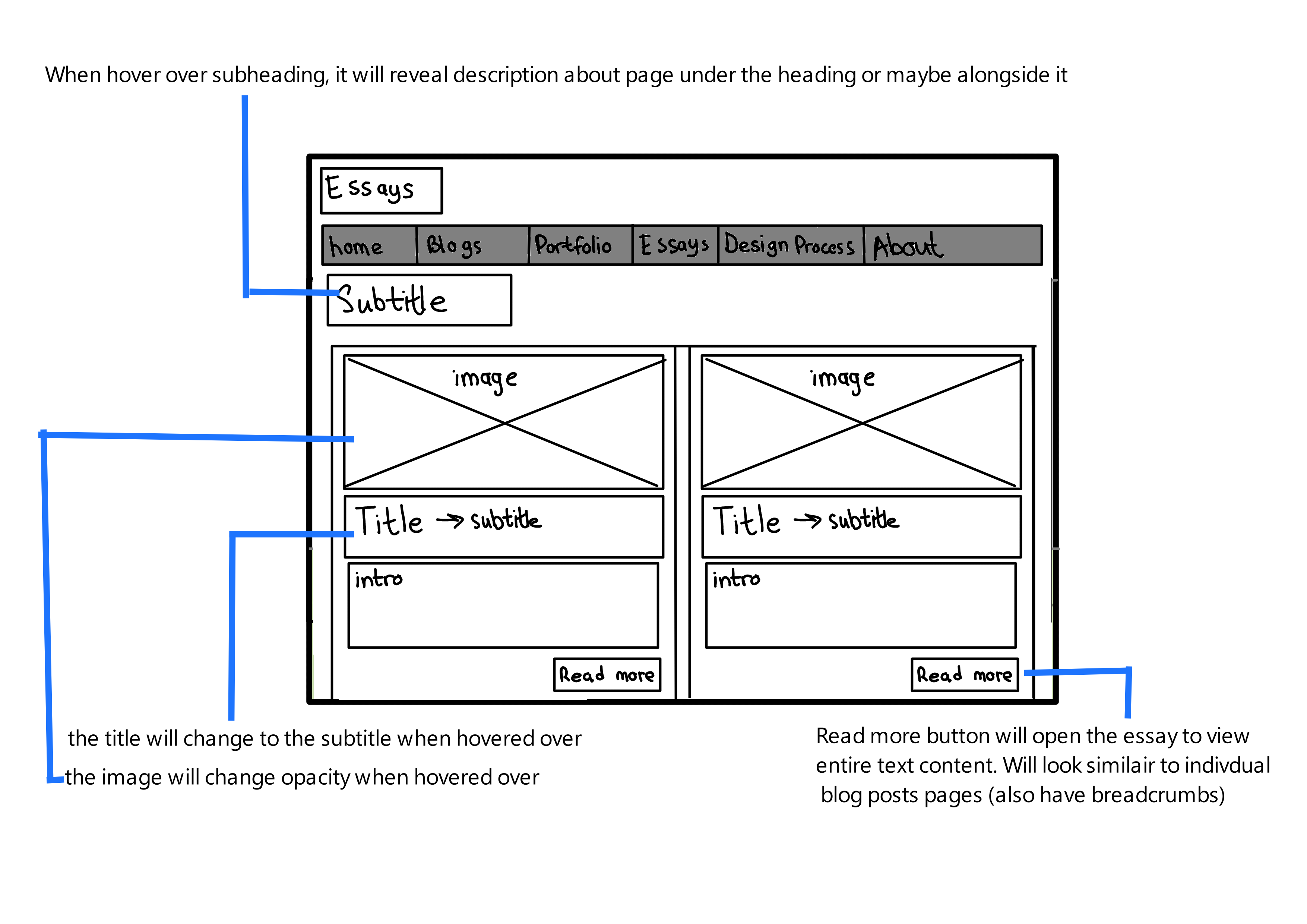
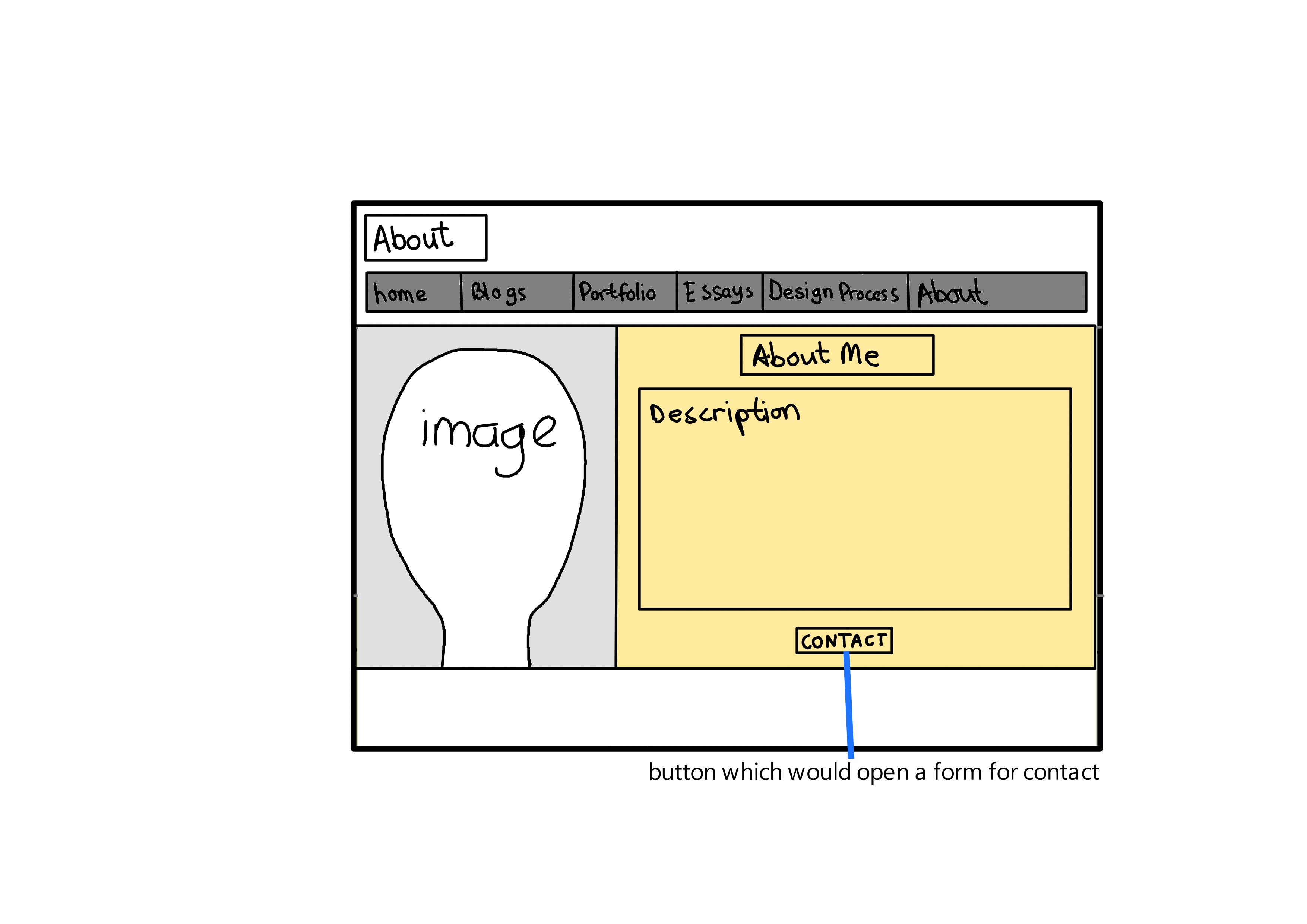
Updated Wireframes and Interactive Elements
Style Guide
Statement: My website showcases a modern, minimalist aesthetic that highlights my expertise in interactive media and game design, ensuring a user-friendly and engaging experience for every visitor.
Defining Visual Aesthetic
The aesthetic of the website aims to be modern, minimalist, and user-friendly. It seeks to create an engaging and interactive experience that showcases creativity through simplicity. The design focuses on showcasing interactive media and game design work, which means it should be visually appealing yet not overwhelming, allowing the work itself to stand out.
This aesthetic complements the content by not overshadowing the showcased work. A minimalist design ensures that the portfolio pieces, blogs, and essays are the focal points. This approach also aligns with the usability principles, ensuring that the website is accessible and easy to navigate.
Color Scheme
A clean and modern aesthetic, leading to the selection of a neutral color palette with one or two accent colors for emphasis (e.g., a vibrant blue or green).
Neutral backgrounds provide a clean canvas that makes content stand out, enhancing readability and user focus. The choice of a vibrant accent color is to draw attention to key interactive elements like calls to action, links, and buttons. This strategy uses color psychology to guide user behavior while maintaining a professional and uncluttered appearance. The neutral backdrop focuses attention on the content, while the color accents guide the user to interactive elements. This approach also aligns with visual accessibility standards.
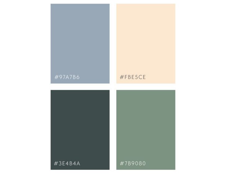
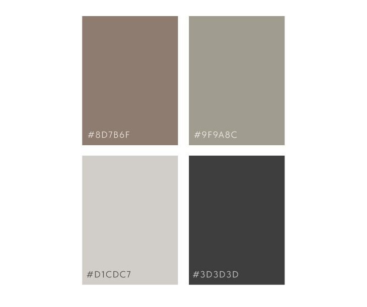
View my color palettes below:
Alignment with Goal
The mix of a subdued blue, a soft peach, a dark sea green, and a muted green suggests a fresh, current vibe that doesn't overpower the user. It's sophisticated and could be great for highlighting design work without competing with it. These colours can be used for interface elements to subtly direct attention and provide a sense of calm and balance.
The neutral palette offers earthy tones, cool grey, light grey, and almost black, implying a grounded, classic look that's often associated with simplicity and elegance. This could be particularly effective in sections that are text-heavy or where I want users to focus on content rather than design, such as blog or essay pages.
I need to remember that colour can carry different meanings and invoke various emotions. My palette has been carefully curated to resonate with the site’s ethos and enhance user experience. The subdued blue sets the professional tone for my portfolio sections, offering a calming backdrop that underscores trust and focuses attention on the content. Soft peach introduces a warm, friendly energy, perfect for call-to-action buttons—encouraging interaction without being overbearing. The use of dark sea green in interactive elements signifies growth and harmony, inviting users to engage confidently with forms and tabs.
The muted green provides a creative spark across sidebars and secondary information, creating a space where innovation is both highlighted and appreciated. For the textual haven of blogs and essays, earthy tones ground the reader in stability, making lengthy reads more comfortable and less visually taxing. The cool grey underpins commitment to a modern, balanced interface, serving as the foundation for metadata and auxiliary details, while light grey offers a restful canvas that allows for user content to truly stand out.
Finally, almost black conveys a definitive strength, anchoring the site’s text with undeniable clarity and sophistication—ensuring legibility and focus where it matters most.
As I refine my style guide, I will consider the legibility of text over these colours, ensuring there is sufficient contrast, particularly for those with visual impairments. Tools like the WebAIM (Web Accessibility In Mind) Contrast Checker can help me ensure that the text is readable against the chosen background colours.
Layout
A structured layout with a focus on simplicity and content prioritization, utilizing a combination of grid-based arrangements for sections and flexible containers that ensure responsiveness.
To maintain visual harmony and ensure content readability, I use gutters of 30 pixels between columns in my grid layout. This spacing allows for clear separation between different elements, helping to delineate sections distinctly without crowding. The vertical spacing between sections is set at 50 pixels. This spacing provides a comfortable visual break for the user, which is crucial for long pages such as essays and detailed design explanations, facilitating easier content digestion and reducing visual fatigue. Margins around the content are dynamically set at 5% of the screen width on larger screens and increase to 10% on smaller screens to ensure content does not feel cramped, especially on mobile devices where space is at a premium.
On my About page, I place a significant image front and center, establishing a personal connection with visitors right away. Directly below the image, I provide a narrative that encapsulates my professional background and ethos. This natural visual-to-text flow guides visitors from a personal introduction to deeper engagement. At the end of this narrative journey, a strategically positioned contact button invites collaboration, acting as a clear call-to-action.
My Blog Index employs a card layout to present posts succinctly. Each card combines a compelling image with a snapshot of content, balancing visual interest with quick insights. This layout honors the visitor’s need for efficiency, allowing for a swift preview of topics without delving into full articles. Navigational aids like breadcrumb links are thoughtfully integrated, offering effortless traversal through the content landscape.
In each Individual Blog Post, I prioritize a storytelling format with a captivating title and opening image that draws readers into the article. The body of the post is framed with generous whitespace, optimizing the reading experience for focus and comfort. Navigational elements are both above and below the post, making it easy for readers to orient themselves and continue their journey through my writings.
My Portfolio page showcases projects in an uncluttered grid, emphasizing the work without distractions. Interactive hover states not only add a layer of engagement but also serve as a prompt for more detailed exploration upon interaction. This design is meticulously crafted to put my work in the spotlight, enabling visitors to navigate my portfolio intuitively, and identify the projects that resonate with them.
A minimalist design ensures that portfolio pieces, blogs, and essays are the focal points, enhancing readability and user focus. This approach aligns with usability principles, ensuring the website is accessible and easy to navigate.
Font Choices
My typographic choices are a blend of aesthetics and functionality, designed to facilitate effortless reading and elevate the user experience. For headings and user interface elements, I've chosen Roboto, a sans-serif font known for its geometric forms and friendly curves, providing a modern and approachable feel. I will use a weight of 700 for headings, making them distinct and assertive on both desktop and mobile displays.
Body text is rendered in Merriweather, a serif font that excels in readability. With its large x-height and slightly condensed letterforms, it's designed to be legible on any screen, thus minimizing eye strain during prolonged reading sessions. The body text is set at a weight of 400, offering an optimal balance of legibility and elegance on various devices.
For captions and less prominent text, utilize a lighter weight of Roboto, ensuring that auxiliary information does not compete with the primary content for attention, yet remains perfectly legible.
View my text samples below:


Interface Element Representations
- Navigation Bar (main and side):
This persistent element at the top of each page allows users to easily navigate across the website without losing their place. It's designed to be minimalistic and clean, ensuring it complements rather than competes with the content. The right-aligned layout respects the Western reading pattern, ending in actionable items like 'Contact' or 'Blog', which encourage further user engagement.
While the side menu bar will be a button that expands into a list with all the title on it, wil also be stick. Usefull for blogs and essay which have muliple entries.
- Buttons:
Buttons are used throughout the site to direct user actions, including submitting forms, starting projects, and reading more about a specific topic. They are styled with rounded corners and a color that stands out against the background, drawing attention while maintaining an aesthetic coherence with the overall design. The hover state introduces a subtle animation that changes the button's color and elevation, providing visual feedback that the button is clickable. Some include Back to top, next, previous, read more.
- Input Fields:
Input fields are essential for interactive forms on the 'Contact' page and in the blog comments section, facilitating user engagement through submissions.
- Image Gallery:
On the Portfolio page, the image gallery allows users to visually explore the different projects I have worked on. Each image is a part of a grid system that expands into a full-size image upon clicking. This interactive gallery is touch-friendly and adapts well to different screen sizes, ensuring that all users, regardless of device, can enjoy a seamless viewing experience.
- Breadcrumb Navigation:
Breadcrumbs provide a pathway for users to trace back their navigation route and explore sections of the site at a higher hierarchy without having to repeatedly use the back button. Placed subtly at the top of content-rich pages, like blog posts or project details, breadcrumbs are small, clickable links that complement the main navigation by offering a textual understanding of the user's location within the site.
- Hover Effects:
Hover effects on links, buttons, and images give users feedback that an element is interactive, which is crucial for understanding possible actions on a page. The effects include color changes, underlining for text links, and scale transformations for images, all of which enhance the interactive experience without distracting from the content.
- Scrolling:
In my design and essay pages, I have implemented a dynamic table of contents (ToC) to streamline the user experience and facilitate easy access to information. This ToC features all the main headings on the page, each linked directly to their respective sections. The ToC provides users with an immediate overview of the content available on the page, allowing them to gauge the scope and depth of the material at a glance. By clicking on any heading in the ToC, users are taken directly to that section, saving time and effort in scrolling through potentially lengthy pages. This is especially beneficial for users seeking specific information who may be in a hurry.
- Sticky Navigation:
users scroll down the page, the ToC remains visible and fixed on the side of the screen (or at the top on smaller devices). This ‘sticky’ feature ensures that the navigation tool is always accessible, no matter where the user is on the page. The ToC actively highlights which section is currently being viewed, giving users a real-time indication of their location within the document. This not only improves the readability by breaking the content into digestible sections but also keeps users oriented as they delve deeper into the text.
These elements enhance the interactive experience without distracting from the content. They improve usability by providing clear pathways for navigation and interaction, supporting a seamless user experience.
Composition
Use visual hierarchy to guide the user's journey through the website, employing size, color, and layout to emphasize important content. Aim for a balance that supports user engagement without distraction, using thoughtful asymmetry to keep the design interesting. Ensure harmony by consistently applying my design choices across all pages.
Consistency and Navigation
- Main Navigation Menu
- Blogs Navigation Menu
- Breadcrumbs
- Table of Contents for Essays and Design Pages
- Side menu bar for essays, blogs
Imagery and Visual Storytelling
Large, medium, and small (depending on the page), expressive images for portfolio and blog entries, also home page, with captions when necessary.
The images provide a visual break from text and help to tell a story, showcasing my work and thoughts effectively. It also aligns with best practices for portfolio sites where visual work needs to be front and center.
Reflection and Summary of Design
Goals and Style Statement
Goals: The overarching goal of my website is to present my skills, experience, and work to engage with my audience meaningfully. It serves as a digital portfolio showcasing my expertise in interactive media and game design, aiming to captivate potential employers, collaborators, and those interested in the field.
Style Statement: My website showcases a modern, minimalist aesthetic that highlights my expertise in interactive media and game design, ensuring a user-friendly and engaging experience for every visitor.
Color
Reflection: The color scheme of my website was chosen to reflect a modern and minimalist aesthetic, aligning with the overall goal of presenting my work in interactive media and game design in a clean and professional manner. The primary palette consists of neutral tones such as cool grey and light grey, complemented by vibrant accent colors like subdued blue and dark sea green. This combination was selected to create a visually appealing contrast that highlights important elements without overwhelming the viewer.
Significance and Defense: Neutral backgrounds provide a clean canvas that enhances readability and focuses attention on the content. The vibrant accent colors draw attention to key interactive elements, such as buttons and links, guiding users through the site. This use of color not only adheres to visual accessibility standards but also employs color psychology to influence user behavior, ensuring a user-friendly and engaging experience. This approach aligns with my goal of making the site visually appealing and easy to navigate for potential employers and collaborators.
Layout
Reflection: The layout of my website is structured to prioritize simplicity and content visibility. Using a grid-based arrangement and flexible containers ensures responsiveness across different devices. Gutters of 30 pixels between columns and vertical spacing of 50 pixels between sections provide clear separation, enhancing readability and user experience. Margins are dynamically set to ensure content does not feel cramped, particularly on mobile devices.
Significance and Defense: A well-structured layout supports visual hierarchy, guiding users through the content in a logical and intuitive manner. The use of grid-based design ensures consistency and balance, making the website easy to navigate. This approach not only aligns with best practices in web design but also caters to the needs of my diverse audience, including potential employers, collaborators, and aspiring professionals. This structure supports my goal of showcasing my work in an organized and visually appealing manner, facilitating engagement and interaction.
Font
Reflection: I chose a combination of Rototo and Merriweather fonts for my website. Rototo is used for headings and titles, providing a bold and modern feel, while Merriweather is used for body text, offering readability and a touch of elegance.
Significance and Defense: The choice of fonts enhances the visual appeal and readability of the website. Rototo's boldness helps in emphasizing important sections, making headings stand out, while Merriweather's readability ensures that long passages of text are easy on the eyes. This combination strikes a balance between modern aesthetics and traditional readability, ensuring a pleasant reading experience across all devices. This decision aligns with my style statement of maintaining a modern and minimalist aesthetic while ensuring content is accessible and engaging.
Information Structure and User Flow
Reflection: The information structure of my website is designed to be intuitive and user-centric. Content is organized into clear sections: Home, Blogs, Portfolio, Essays, Design Process, and About. Each section is easily accessible through a persistent navigation menu, ensuring users can find what they need without excessive clicks. The use of breadcrumbs and a table of contents further enhances navigability, providing users with multiple ways to explore the site.
Significance and Defense: A well-organized information structure is crucial for user experience. By categorizing content logically and providing multiple navigational aids, I ensure that users can easily find and interact with the information they seek. This structure supports the goal of showcasing my work and engaging my audience effectively, whether they are potential employers looking for specific projects or students seeking inspiration from my blog posts. This approach ensures that my content is accessible and user-friendly, aligning with my goal of presenting my work in an organized and engaging manner.
User Experience
Reflection: The user experience is designed to be seamless and engaging. Interactive elements, such as hover effects, scrolling animations, and a dynamic table of contents, enhance the interactivity of the site. The layout adjusts to different screen sizes, ensuring a consistent experience across devices. The inclusion of a 'back to top' button and sticky navigation elements further improves usability.
Significance and Defense: A positive user experience is vital for retaining visitors and encouraging interaction. By incorporating interactive elements and ensuring responsiveness, I provide a dynamic and engaging experience that caters to the needs of various users. These design decisions are defended by their ability to enhance usability, accessibility, and overall satisfaction, aligning with best practices in user experience design. This approach supports my goal of creating a user-friendly and engaging website that effectively showcases my work and expertise.
Implementation Notes
How it all comes together
The UI and UX design choices of my website profoundly impact the organization and functionality of the code, ensuring it remains user-friendly and accessible. The folder structure of my website is carefully organized to reflect the hierarchical information structure, with separate folders for blogs, essays, portfolio, and design, each containing its own index.html and individual content pages. This organization ensures that content is logically separated, making it easier for users to navigate and for developers to manage.
Separating content into distinct folders aligns with best practices for content management and organization. It makes the site easier to maintain and update, ensuring that each section can be developed independently without affecting other parts of the site. This structure also facilitates better scalability as new content can be added without disrupting the existing organization.
This separation of concerns is further extended into distinct folders for CSS and JavaScript, promoting modularity and scalability. For example, the styles.css file houses all styling rules, ensuring consistency across all pages, while separate JavaScript files (main.js, menu.js, blogs.js, backToTop.js) manage different functionalities, making the website easier to maintain and update.
By separating CSS and JavaScript into their own files, we ensure that styling and functionality are modular and reusable. This modularity allows for easier debugging and updates since changes in one part of the site won't inadvertently affect other parts. This structure supports the principle of separation of concerns, which is fundamental for scalable and maintainable web development.
Semantic markup is a key component of the website, providing clear context to browsers and assistive technologies. The use of tags like <header>, <nav>, <section>, <article>, and <footer> enhances accessibility and ensures that interface elements, such as navigation bars, buttons, and forms, are fully and correctly expressed.
Semantic tags improve the readability of the HTML for developers and assistive technologies, enhancing accessibility for users with disabilities. They provide a clear structure to the content, which helps screen readers interpret and navigate the site more effectively. Additionally, search engines use semantic tags to better understand and index the content, improving SEO.
For instance, the navigation bar uses semantic <nav> tags and ARIA attributes to improve usability for screen readers.
The <nav> tag explicitly defines the navigation section of the page, while ARIA (Accessible Rich Internet Applications) attributes provide additional context for screen readers, ensuring that navigation elements are accessible to all users, including those who rely on assistive technologies.
JavaScript is used extensively to handle various interaction points, such as menu toggles, breadcrumbs, scrolling, back-to-top functionality, and dynamic blog menu generation. Event listeners are registered within the DOMContentLoaded event listener to ensure the scripts execute only after the HTML has been fully loaded, enhancing performance and user experience.
Registering event listeners within the DOMContentLoaded event listener ensures that the scripts only run after the page content is fully loaded, preventing errors that might occur if the scripts try to manipulate elements that are not yet available. This approach improves the performance and reliability of the website.
Key functionalities, such as form submissions, are handled using the Formspree API. By connecting my contact form to the Formspree service, I ensured that user inquiries are efficiently processed and delivered to my email, providing a seamless and reliable communication channel.
Using Formspree for form submissions offloads the server-side processing, reducing the complexity of the backend and ensuring that form submissions are handled securely and reliably. This approach improves user experience by providing a quick and efficient way to contact me without requiring extensive server-side infrastructure.
Interaction points and functionalities are consolidated where possible to avoid repetition and improve maintainability. For instance, common functionalities like menu toggles are handled in menu.js, while scrolling effects are managed in scrolling.js.
Consolidating common functionalities into separate files reduces code duplication and makes the codebase easier to manage. This approach adheres to the DRY (Don't Repeat Yourself) principle, which promotes reusability and maintainability in software development.
CSS is used extensively to ensure consistent styling across all pages, avoiding inline styles to maintain a modular approach. The use of media queries ensures responsive layouts that adapt to different screen sizes and devices, enhancing the user experience.
External CSS files enable consistent styling across the entire site, making it easier to implement and maintain a cohesive design. Media queries allow the design to be responsive, ensuring that the site looks and functions well on various devices, from desktops to smartphones. This responsiveness is crucial for providing a good user experience across different screen sizes.
Reusable classes and CSS variables are utilized to maintain consistency and efficiency. This approach reduces redundancy and ensures that changes can be made swiftly across the entire website. For example, common elements like buttons, headings, and containers have their styles defined once and applied across all relevant pages.
Using reusable classes and CSS variables promotes a clean and efficient CSS structure. It reduces redundancy and ensures that any changes to the styling need to be made in only one place, making the site easier to update and maintain. This approach aligns with best practices for maintainable and scalable CSS design.
Performance Optimization One significant aspect of the development process was optimizing performance by using the defer attribute in script tags. The defer attribute allows scripts to be downloaded in parallel with the rest of the page and executed only after the HTML has been completely parsed.
Using the defer attribute improves page load times by ensuring that scripts do not block the rendering of the page. This approach enhances the user experience by allowing the content to load faster, making the site more responsive and interactive. It also contributes to better performance metrics, which are important for SEO and user satisfaction.